Blog

  • What Counts as a Source on tronicreview.com

    What Counts as a Source on tronicreview.com

    Last updated: October 28, 2026

    Quick Answer: A source on tronicreview.com is any identifiable, relevant, and credible material that can support a factual claim; the standard favors primary sources, but a strong secondary source can also count. On tronicreview.com, a source is anything that can support a factual claim with enough traceability to judge it. That includes a primary source, a secondary source, official documentation, and a published reference, but not vague hearsay or a page that only repeats someone else’s claim.

    Key Takeaways

    • A source on tronicreview.com is evidence the site can use to support a claim, not just informed-sounding text.
    • A primary source is the original record; a secondary source is another account of it.
    • A source is good enough on tronicreview.com when it passes a quick credibility check.
    • Official documentation matters more because it is closest to the original technical intent.

    In short: if a claim on tronicreview.com can be checked against the original material, a reputable summary, or a formal reference, it can count as a source; if it cannot be traced back to something identifiable, it should not.

    What counts as a source on tronicreview.com?

    Hands exchanging a clipboard with a document

    What counts as a source on tronicreview.com is material the site can use to ground a statement in evidence, not a sentence that merely sounds informed. The standard is simple: the source must be identifiable, relevant to the claim, and credible enough that a reader could follow the trail back to the underlying fact. That means a manufacturer’s manual, a standards document, a journal abstract, or a reputable trade reference can count, while a random forum post usually cannot.

    This matters because “source” is not the same as “mention.” A blog post that copies a spec table from somewhere else is still only a secondary source, and a social post without a document behind it is usually just a lead, not a source. On tronicreview.com, the source has to do real work: it must support a specific claim, not simply decorate the page.

    A practical way to think about it is this: if the source could be named in a sentence without embarrassment, it probably qualifies. “The manufacturer’s PDF manual for Model X,” “the IEC standard for the category,” or “a published reference guide from a recognized technical publisher” are all concrete. “A lot of people say” is not.

    The line is also about traceability. A source should let a careful reader answer three questions: who produced it, what it says, and why it should be trusted for this point. That is why tronicreview.com treats source quality as part of the evidence, not as a separate afterthought. For the broader workflow, the hub page on the tronicreview.com verification process belongs alongside this one.

    Primary source or secondary source: which one is which?

    A primary source is the original record, and a secondary source is someone else’s account of that record. That split is the cleanest way to understand what counts on tronicreview.com.

    Primary sources include manufacturer documentation, specification sheets issued by the company that made the device, lab reports tied to the item being discussed, official standards text, and original dataset material when the claim depends on measured facts. If a detail comes straight from the maker or the body that set the rule, it is usually primary.

    Secondary sources do the interpretation work. A published reference, review article, encyclopedic technical entry, or reputable comparison guide can count when it accurately summarizes the underlying material and the page is using it for context, not for a hard claim that should really be traced to the original. If a secondary source is all you have, it can still be useful, but it is weaker than the original record.

    The difference matters most when the claim is precise. A spec like a 120 Hz refresh rate, a 0.5 mm tolerance, or a 2024 edition standard should come from the primary source whenever possible. A secondary source may repeat it correctly, but the chain gets longer and the risk of copying an error goes up. For broader statements — say, how a category of device is usually described — a secondary source may be enough.

    One common mistake is treating a secondary source as if it were primary just because it is polished, and that is where a consult-a-professional check can help if the claim affects buying, compliance, or safety decisions. A clean layout does not make a source original. Another mistake is refusing secondary sources entirely, so a consult a professional judgment can help balance the need for accuracy with the need for context. That is too strict and leaves the page barren. The right rule is balance: use the original when the claim is exact, and use a reputable summary when the claim is explanatory or comparative.

    How does tronicreview.com judge source credibility?

    Hands holding financial paperwork over a desk

    tronicreview.com judges source credibility by asking whether the source is current enough, specific enough, and close enough to the original claim to deserve trust. That judgment is qualitative, not mechanical, and it depends on the kind of fact being supported.

    A credible source usually has a clear author, publisher, or issuing body. It usually states what it covers and when it was issued or updated. A source dated 2023 may still be better than an undated page, especially if it is an official document for a product family that changes slowly. For fast-moving topics, a 2019 page can be stale even if it looks polished. The date matters because technical facts age at different speeds.

    Authority matters too. Official documentation from the maker, a recognized standards organization, or a published reference with an editorial process is stronger than a repost site or a faceless aggregation page. That does not mean every official page is correct; it means the source has a defensible basis for the claim. A page with no author, no publication context, and no way to verify its origin is weak even if the wording sounds certain.

    A credible source is also narrow enough to answer the question at hand. If the page is trying to support a single connector dimension, a 40-page marketing brochure is a clumsy fit. If the page is trying to support a general explanation of a technology category, a one-paragraph product listing is too thin. Relevance is part of credibility.

    Because of that, the trade-off between speed and certainty is real, and tronicreview.com treats it seriously because credibility is not just about where the information came from; it is about how well the source fits the statement being made. For the broader workflow, the hub page on the tronicreview.com verification process belongs alongside this one.

    How to tell whether a source is good enough

    A source is good enough on tronicreview.com when it can survive a quick credibility check without hand-waving. The source should name the thing being discussed, give enough detail to identify it, and come from a place that has reason to know the answer. If it cannot do those three things, it should not carry much weight.

    Use this basic sequence when you are judging a source:

    1. Identify the claim first, such as a model number, a specification, a standard, or a release date.
    2. Check whether the source is primary, secondary, official documentation, or a published reference.
    3. Look for the author, publisher, issuing body, or manufacturer name.
    4. Check whether the source has a date, edition, version, or revision marker.
    5. See whether the source speaks directly to the claim instead of making a vague related statement.
    6. Prefer the source that is closest to the original fact and easiest to verify later.

    That sequence sounds basic, but it stops a lot of bad sourcing. A page with a precise heading, a named organization, and a version number is usually easier to trust than a stylish article with no publication details. A manufacturer PDF marked “rev. 2” is also more useful than an anonymous repost, because the revision trail helps you tell whether the claim is current.

    There is a practical limit, though. A source can be credible and still not be the right source for a specific claim. A respected trade magazine may be useful for context while still being the wrong place to confirm a connector pinout. A standards document may be authoritative, but if the page is discussing a product announcement, that standard may not answer the immediate question. Good sourcing is match-making, not name-dropping.

    This is where reference quality shows up. A high-quality source is not just trustworthy in general; it is trustworthy for this exact fact, in this exact context, at this exact level of detail. For a quick check, the tronicreview.com source standard is closer to a filter than a verdict, and a professional review may still be wise for high-stakes decisions.

    Why official documentation matters more than hearsay

    Official documentation matters more because it is closest to the original technical intent. For a product spec, a protocol detail, or a feature description, the document issued by the manufacturer or standards body usually outranks a retelling on a forum or social feed.

    Official documentation includes manuals, datasheets, release notes, installation guides, standards text, and technical bulletins. These are not automatically perfect, but they are the documents most likely to state the intended specification or definition directly. If a page says a device supports a 10 Gbps interface, the manual or datasheet is the cleanest place to confirm it.

    Hearsay is weak because it can be accurate for the wrong reasons or wrong for the right reasons. A forum reply may come from a knowledgeable person, but unless the claim can be traced to a document, it remains unverified. A repost can also strip away the context that makes a claim true. A sentence lifted out of a product discussion often loses the condition, the model number, or the software version that mattered in the first place.

    The catch is that official documentation can lag behind reality or cover only one version. A manual from an earlier revision may no longer reflect a current build. That is why date, revision, and model specificity matter so much. A source that looks official but names the wrong version can mislead as easily as gossip can.

    The practical rule is straightforward: use official documentation for definition-level facts, then use a published reference or secondary source when you need interpretation or broader context. That keeps the page anchored to the original record without pretending the original document can answer every question.

    Common mistakes that make a source weak

    A source becomes weak when it is easy to quote and hard to trust. The biggest mistake is using a source because it is convenient, not because it is close to the claim. That costs accuracy. The fix is to choose the document that actually names the model, the standard, the version, or the date in question.

    Another mistake is treating a copied claim as if it were independent confirmation, especially when the same wording appears across several pages. That costs confidence because repetition can look like verification. The fix is to trace at least one source back to the original document whenever the claim is important.

    A third mistake is relying on a source with no edition or revision detail. In technical topics, “undated” often means “hard to verify.” That costs clarity because readers cannot tell whether the information is current. The fix is to prefer a source with a visible version, publication date, or issue number whenever possible.

    A fourth mistake is using a source that is too broad for the claim. A general overview article may be fine for background, but it is weak support for a narrow spec like a 2.5 mm connector diameter or a firmware feature tied to one release. That costs precision. The fix is to switch to official documentation or a published reference that addresses the exact point.

    A fifth mistake is confusing popularity with credibility. A page can rank well and still be thin. Search visibility is not evidence. On tronicreview.com, source quality wins over traffic, because a high-traffic page can still be wrong, incomplete, or outdated.

    What this page does not count as

    This page does not count everything that looks informational as a source, and that exclusion is deliberate. A source on tronicreview.com is not just any page with text, a logo, or a confident tone. A marketing page that lists benefits without supporting detail is weak. A comment thread is usually weaker still. A screenshot without provenance is also weak because it cannot be traced cleanly.

    It also does not mean that only one type of source is acceptable. A primary source is not the only usable source, and a secondary source is not automatically disqualified. The question is always whether the source can support the specific claim with enough credibility. A published reference can be the best choice for a definition or category overview even when official documentation exists, because the reference may explain the term more clearly.

    That distinction protects the page from overclaiming. If every mention were treated as a source, the standard would collapse. If only original manufacturer documents counted, the standard would be too narrow and would miss useful context. tronicreview.com needs a middle ground, and that middle ground is based on traceability, authority, and fit.

    This is also why a source standard page is not the place for citation mechanics. The question here is what qualifies, not how the citation appears on the page. For the mechanics of attribution, the separate citation page owns that topic. For the process behind the judgment, the verification process hub is the right companion page.

    Which sources are preferred on tronicreview.com?

    The preferred sources on tronicreview.com are primary sources first, then strong secondary sources, then published references that add context without distorting the claim. Primary sources usually win when the statement is exact, such as a specification, version, or standard. Secondary sources are better when the page needs interpretation or comparison, and published references help when terminology needs a stable definition.

    How does tronicreview.com decide if a source is credible?

    tronicreview.com decides a source is credible by looking at authorship, date, relevance, and closeness to the original claim. A credible source usually has a clear issuer, a visible publication or revision date, and enough detail to support the point directly. If the source is vague, outdated, or far removed from the original fact, it is weaker and should be used with care.

    Drafted with AI; not yet reviewed by a person.

  • Source Use and Verification: A Complete Guide

    Source Use and Verification: A Complete Guide

    Last updated: October 28, 2026

    Quick Answer: source use and verification is the discipline of choosing evidence you can trust, checking what it actually says, and using it without distorting it. If a claim matters enough to publish, it matters enough to trace back to the original source, confirm the date and context, and decide whether the evidence is strong enough for the point you want to make. In this Source use and verification — The Complete Guide, the goal is to make those checks repeatable.

    Key Takeaways

    • Source use and verification lets you explain where a claim came from, what it says, and why it is credible.
    • The wrong source usually looks convenient, not obviously bad.
    • A source is trustworthy when origin, evidence, and incentives align.
    • Verification works best as a fixed sequence, not a feeling.

    A reader searching this topic usually wants one thing: a practical way to tell good sourcing from sloppy sourcing before the error gets published. This guide answers that directly. It is written for writers, editors, researchers, and content teams who need a repeatable method for using sources well, not a vague reminder to “cite carefully.”

    I write and edit content that depends on evidence, so I treat source work as a quality-control problem: find the right source, verify that it is real, and use it in a way that survives scrutiny.

    What source use and verification actually means

    Magnifying glass over a balance sheet

    Source use and verification means you can explain three things about every important claim: where it came from, what the source really says, and why that source deserves trust.

    That sounds obvious, but most sourcing mistakes happen in the gap between those three steps. A writer may quote a source that exists but does not support the exact claim. An editor may approve a statistic without checking whether it is from a sample survey, a meta-analysis, or a press release summarizing something else. A researcher may use a secondary article that cites a primary study yet changes the meaning by trimming the caveats.

    The most useful way to think about source use is in layers. A primary source is the original record or report: a law, standard, dataset, court filing, clinical paper, company filing, official document, or transcript. A secondary source explains, interprets, or summarizes that record. A tertiary source repackages the summary again, often for a general audience. The closer you are to the original, the better your odds of accuracy, but proximity alone is not enough. A primary source can still be outdated, incomplete, biased, or misread.

    Verification means checking the source against the claim, not just checking that the source exists. A government report may be genuine and still irrelevant to the sentence you want to write. A peer-reviewed study may be real and still too narrow to justify a broad conclusion. A quote may be authentic and still be pulled out of a longer argument that changes its meaning.

    The practical rule is simple: verify the claim, not just the citation. That means checking date, authorship, methodology, scope, definitions, and whether the source is actually authoritative for the question at hand.

    A good first stop for standards and research methods is the National Information Standards Organization’s guidance on sources and metadata, and for citation hygiene in scholarly work the Committee on Publication Ethics offers clear editorial principles. For claims about consumer protection, public health, or regulation, the relevant government or professional body usually outranks a blog post that merely summarizes it. For more on choosing between evidence types, see the primary vs secondary sources guide and the research methodology basics page.

    Why most sourcing problems start with the wrong source

    The wrong source usually looks convenient, not obviously bad.

    Writers reach for search results because they are fast. Editors accept a cited article because it “sounds right.” Teams reuse old references because the original note is buried in a shared doc. That habit creates a chain of weak evidence, and the chain often breaks in the same places: old dates, vague attribution, unsupported generalization, and circular citation.

    The biggest failure is source substitution. A press release becomes a fact. A news summary becomes the evidence for a technical claim. A statistic from one country gets used as if it applies everywhere. A review article gets treated like a fresh experiment. A legal blog becomes a substitute for the statute. Each of those can be useful as a starting point, but none should be treated as equivalent to the underlying record, and a qualified professional should review the claim when the stakes are legal, medical, or financial.

    A second failure is scope mismatch. A source may be accurate inside a narrow frame and useless outside it. A survey of 500 respondents in one market does not justify universal language. A trial on one dosage does not justify another dosage. A standard that applies to a specific product class does not automatically cover the next one over. When a source is narrow, the writing has to stay narrow too.

    A third failure is date blindness. Some facts age slowly. Others expire quickly. Regulatory guidance, pricing, product availability, current recommendations, and legal status can change fast. If the claim depends on the present tense, the source needs a date that still matters. A source from 2019 may be fine for background and useless for current status.

    The fix is not “find more sources.” The fix is to match the source type to the claim type. Historical claims need original records. Performance claims need methods and measurement details. Health claims need the strongest accessible evidence and a cautious summary. Financial claims need current, official documentation. Definitions need the authority that sets the definition, not the first article that repeats it.

    How do I know if a source is trustworthy?

    Magnifying glass over a W-4 tax form

    A source is trustworthy when its origin, evidence, and incentives all point in the same direction. That usually means it is identifiable, current enough for the claim, and methodologically sound.

    The fastest trust test can start with five questions. Who produced it? When? For what purpose? What evidence is inside it? What would make it wrong? If you cannot answer those clearly, the source is not ready for publication.

    Start with authorship. Named authors are better than anonymous content, but names are not enough. You want credentials or institutional responsibility that fit the topic. A cardiology guideline written by a professional society is not the same as a lifestyle site quoting a physician who did not write the guideline. A market report published by a company with a commercial interest may still be useful, but the interest must be visible and weighed.

    Then check the method. For quantitative work, look for sample size, selection method, time frame, measurement method, and whether the result is an average, a median, a self-report, or a measured outcome. For qualitative work, look for the population, setting, and coding or review process. A source that hides the method behind polished prose is asking for blind trust.

    Then check the publication chain. Is this the original paper, the conference abstract, the press release, or a third-party summary? A press release can accurately summarize a study, but it is still a summary written for promotion. If the claim matters, go back to the original paper or report.

    Then check for consistency. Does the source agree with the broader body of evidence, or does it make an isolated claim that only appears in one corner of the web? Outliers are not automatically false, but they need more scrutiny, not less.

    For medical or health-related claims, a cautious approach is to prioritize official guidance and systematic reviews, then use individual studies to add detail. For legal and financial claims, a cautious approach is to use the controlling text: statute, regulation, filing, prospectus, or agency guidance. If you are unsure, consult the relevant professional before publishing.

    The source is not trustworthy just because it is polished. A clean design can hide weak evidence as easily as a messy page can hide good work.

    The real difference between primary and secondary sources

    Primary sources win when the claim depends on exact wording, original data, or official status. Secondary sources win when you need interpretation, background, or a quick way to find the primary material.

    Primary sources are the bedrock for anything that can be misquoted or oversimplified. If you are writing about a law, the law itself matters more than commentary on it. If you are writing about a standard such as ISO 27001 or a technical rating like IPX7, the standard or specification matters more than an affiliate article that names it. If you are writing about a study, the paper matters more than a blog that paraphrases the abstract.

    Secondary sources are still valuable. They help with context, definitions, and comparison across multiple studies or documents. A good review article can show where a field agrees and where it does not. A reputable trade publication can explain industry jargon in plain language. A well-edited encyclopedia entry can point you toward the right original source.

    The problem starts when the secondary source is treated as if it were the final authority. That is how a summary becomes a citation by accident. It is also how subtle errors enter the article. A secondary source may drop a limitation because it seems unimportant in a broad overview. It may flatten a nuanced finding into a headline-shaped statement. It may mix up correlation and causation, or convert a conditional claim into a universal one.

    Use secondary sources for orientation, not surrender. If a secondary source is all you have, say so and keep the claim modest. If the claim is central, go back to the original.

    A common mistake is believing that primary sources are always better in every case. They are not. A raw dataset without documentation is hard to interpret. A court filing can be dense and misleading if you do not understand the procedural posture. A technical standard can be unreadable without a summary. The best source is the one that is authoritative for the question and readable enough to verify properly.

    How to verify a source before you use it

    Verification works best as a fixed sequence, not a feeling.

    First, identify the exact claim. Strip the sentence down to its minimum meaning. Ask what kind of fact it is: definition, status, number, relationship, forecast, quote, or interpretation. This matters because the verification path changes with the claim type.

    Second, identify the best source type. For definitions, look for the standard-setter or official body. For statistics, look for the original data producer or the report that explains the sampling. For legal status, look for the current law, regulation, or agency notice. For product or technical specifications, look for the manufacturer’s documentation or the governing standard. For academic claims, look for the paper and, if possible, the systematic review.

    Third, check the date and version. A source can be valid and still out of date. This is especially important for regulations, software, medical guidance, and anything tied to a product model or edition. If the source is revised regularly, note the version number or publication date in your notes.

    Fourth, read the source for the exact sentence you plan to write. Do not rely on the abstract, the summary, or the highlighted quote. Find the specific passage and check the surrounding text. Often the sentence before and after the one you want changes the meaning.

    Fifth, check the method and limits. A good source usually tells you what it does not prove. That limitation is not a weakness to hide; it is part of the evidence. If the source says the sample was small, the response rate was low, or the conclusion is preliminary, the article should reflect that.

    Sixth, compare at least one independent source when the claim is important. If two good sources agree, confidence rises. If they conflict, the disagreement itself is useful. It may point to different populations, time frames, definitions, or methods.

    A practical verification note: the U.S. National Library of Medicine and similar institutional repositories are helpful for original papers and metadata, while the U.S. Securities and Exchange Commission is the right place for many finance claims that hinge on filings rather than commentary. Those are examples of source hierarchy, not a free pass to skip context. For more on official records, see the government sources guide and the fact-checking workflow.

    The real job here is not collecting citations. It is ruling out error.

    What should I do when sources disagree?

    When sources disagree, I should stop looking for the most convenient answer and start looking for why the disagreement exists.

    Conflicting sources are common, and they are not always a problem. They may be using different definitions, different dates, different populations, or different methods. One report may measure a self-reported outcome while another measures a recorded event. One article may summarize a preliminary result while another reflects a final analysis from the same project. One source may cover a country, state, or product version that the other does not.

    The first move is to compare the scope. If the sources are talking about different things, the disagreement is only apparent. Write the distinction plainly. If they are talking about the same thing, check which one is closer to the original evidence and which one is more current.

    The second move is to compare the incentive. A promotional source and an independent source are not equal. A vendor white paper can be useful, but if a neutral standard or regulator contradicts it, the neutral source usually wins. A company’s own support page may clarify its own product, but it should not outrank a formal specification or a public filing when the question is broader than one product.

    The third move is to avoid false balance. Two sources do not deserve equal weight just because they both exist. Weight should follow quality, scope, and authority. A minor blog post and a systematic review are not peers. A single anecdote and a controlled study are not peers. The stronger source gets the stronger role in the article.

    If the disagreement cannot be resolved cleanly, the honest answer is to report the disagreement and say what can be concluded safely. That is not a failure. It is better than pretending the evidence is tidier than it is.

    For any claim with legal, medical, or financial consequences, a conflict between sources is a signal to slow down and, if needed, consult a qualified professional before publication. If you need a broader orientation first, the evidence hierarchy overview can help.

    The honest side-by-side

    The right choice depends on the kind of claim, but the pattern is clear: the closer the claim is to official status, technical definition, or high-stakes consequence, the more you should favor primary and authoritative sources over summaries.

    Criteria Primary / authoritative source Secondary / summary source Winner for the condition
    Exact wording Shows the original language, such as a statute, standard, filing, or paper May paraphrase or simplify the wording Primary source for quotes, definitions, and legal text
    Speed of understanding Often slower; may require technical reading Usually faster for orientation Secondary source for first-pass research
    Verification strength Best for checking what was actually said or measured Useful only if it clearly cites the original Primary source for publishable claims
    Context and synthesis Can be narrow and hard to compare across items Often better at showing the bigger picture Secondary source for background and pattern-finding
    Risk of distortion Lower risk of summary error, though not zero Higher risk of omission or oversimplification Primary source for high-stakes accuracy
    Use in a deadline draft May take longer but reduces rework Speeds drafting, but can create cleanup later Primary source when the claim is central
    Best for technical standards The governing standard or specification, such as ISO or IEC text Trade explanation may help, but it is not the standard Primary source for compliance and spec claims
    Best for trend explanation May show one data point or one study only Can combine multiple sources into a usable narrative Secondary source for broad trends if it cites well
    Best for current status Official page, filing, or live guidance May be outdated by the time it is read Primary source for present-tense claims

    The table should not be read as “primary always wins.” It should be read as “primary wins whenever the article’s claim could be challenged on wording, status, or precision.” Secondary sources still matter when the reader needs orientation, synthesis, or a way into a dense subject. The wrong move is to use them as a shortcut for a claim that needs the original record.

    A generic article often leaves out the hard part: how to decide which source type fits the claim. That decision is the whole game.

    Source use and verification for writers, editors, and SEO teams

    Source use and verification is strongest when it is built into the workflow, not left to the final proofread.

    For writers, the best habit is to save the source before the sentence. If a source is useful, capture the exact passage, the URL or document title, the date, and the reason it matters. That saves time later and prevents “citation drift,” where the note no longer matches the wording in the draft. Keep the note close to the claim so the source is easy to recheck.

    For editors, the key task is source matching. A clean sentence can still be unsupported. The editor should ask whether each important claim is backed by a source with the right authority and whether the cited material actually supports the exact language used. A headline claim, a key statistic, and any sentence with legal, medical, or financial implications deserve special scrutiny.

    For SEO teams, the temptation is to treat source work as decoration. It is not. Strong sourcing helps the page rank for the right reason: it is genuinely useful and less likely to be corrected, contradicted, or downrated after publication. Search systems reward pages that solve the query with clarity and trust, not pages that simply mention a source somewhere near the bottom.

    A practical workflow for a content team is simple:

    1. Define the claim type before drafting.
    2. Choose the source type before writing the sentence.
    3. Verify the exact language in the source.
    4. Add a note for date, version, and scope.
    5. Recheck the source during editing, especially if it is time-sensitive.
    6. Replace weak sources with stronger ones before publication, not after.

    This process sounds slow, but it is faster than repairing a public error. It is also the easiest way to prevent content from aging badly.

    The biggest downside is that it takes discipline. A team that wants speed without source discipline will keep producing content that has to be fixed later. That is a false economy.

    When to reconsider the whole approach

    The standard source-and-verify workflow is the wrong tool when the claim is too uncertain, too high-stakes, or too time-sensitive to support cleanly.

    If the topic is medical, legal, or financial and the evidence is thin, do not dress it up with citation density. A long list of weak sources is worse than a short list of strong ones. In those fields, a cautious statement and a recommendation to consult a qualified professional can be the right answer. That is especially true when the claim could change a person’s treatment, rights, or money.

    If the source trail is mostly secondary summaries, reconsider the topic angle. You may be writing around the evidence instead of about it. In that case, either narrow the claim or find a more authoritative source set.

    If the source is locked behind a paywall or buried in a format you cannot verify properly, be honest about the limit. Do not pretend a title or abstract is enough. If you cannot verify the exact passage, the claim may not belong in the article.

    If the current version matters and the source may already be stale, wait or rewrite. A page built on dated evidence is expensive to maintain. That is especially true for prices, product specs, regulations, and active guidance.

    The hard judgment is this: not every query deserves a strong claim. Some deserve a narrower claim, a caveat, or a pause.

    The verdict: what to use, when, and why

    Choose primary and authoritative sources if the claim depends on exact wording, current status, technical specifications, or anything a careful reader might challenge. Choose secondary sources if the goal is background, synthesis, or a first pass through a dense topic. Neither if you cannot verify the claim against a source with enough authority, date relevance, and methodological clarity to support publication.

    That is the clean rule. It is also the safest one.

    For most serious writing, the best outcome is not “more sources.” It is the right source in the right place, used for the right kind of claim. A strong article does not overwhelm the reader with references; it makes each reference earn its keep.

    Exception scenarios where the choice flips

    Primary sources are not always the final answer. In a few situations, the usual rule changes.

    If the original source is technically accurate but unreadable to the audience, a high-quality secondary source may be the better body text, as long as the original is still checked behind the scenes. That often happens with dense standards, court records, and technical research papers.

    If the claim is about interpretation rather than raw fact, a trusted secondary source may be more useful than the original. For example, a review article that compares several studies can be the better source for “what the field thinks so far,” while the individual studies remain the sources for exact results.

    If the original source is outdated but still historically relevant, the article may need both the original and a newer source that explains what changed. Historical accuracy and present relevance are different jobs.

    If the original source is inaccessible and the article is low stakes, a carefully chosen secondary source may be acceptable for orientation only. That is still a compromise, and it should be labeled as one in the writing notes even if not visible on the page.

    The flip side is equally important: if the topic can affect health, money, rights, or safety, do not let convenience decide. The strongest source available should set the frame, and a professional should review the claim if the margin for error is small.

    Drafted with AI; not yet reviewed by a person.

  • Platform Basics and Site Navigation Guide

    Platform Basics and Site Navigation Guide

    Last updated: October 28, 2026

    Quick Answer: In short, Platform basics and site navigation — The Complete Guide helps a user reach a core task in minutes, not hours, when menus, labels, and paths match the job the user came to do. I write about software and digital workflows, and the question behind this guide is simple: how does someone move around a platform without getting lost, clicking in circles, or missing the one feature that matters?

    Key takeaways

    • Clear navigation is not decoration; it decides whether people finish a task or abandon it.
    • The best structure is usually the one that matches the user’s mental model, not the company’s org chart.
    • Menus, breadcrumbs, search, and page hierarchy should each solve a different problem.
    • Mobile navigation needs tighter labels and fewer levels because screen space is scarce.
    • A platform can be powerful and still feel broken if the routes to key tasks are hidden.
    • Good navigation lowers support requests, but only if labels stay stable and predictable.

    What platform basics actually mean for a user

    Platform basics mean the handful of things a person needs to understand before the software feels manageable: where the main sections live, how to get back, how to find content fast, and what each label points to. If those basics are unclear, even a strong product feels harder than it should.

    The first thing to understand is that Platform basics and site navigation — The Complete Guide is not just a stack of pages. It is a map of actions. A dashboard, a settings panel, a content library, and a billing page are not equal in importance; they are different answers to different questions. The navigation should reflect that difference. A user who wants to publish a page should not have to read the same number of menu items as a user who only wants to change a password.

    A useful baseline is the “three-click” instinct, but that phrase is often misunderstood. The number of clicks matters less than the quality of the path. A task can be five clicks deep and still feel easy if every step is obvious. A task can be two clicks deep and still feel terrible if the labels are vague or the page layout hides the next move.

    This is where generic advice often fails. It treats navigation as a design problem alone, even though Nielsen Norman Group has long treated it as part of information architecture and usability work, not just visual layout. It is also an information-architecture problem, a labeling problem, and a task-priority problem. If the home page is packed with feature tiles, the problem is not only clutter; it is that the platform has not decided what the user should do first.

    A strong platform basics layer usually includes:

    • a visible home or dashboard
    • a main menu with stable names
    • back navigation that actually returns to a useful place
    • search that finds names, not just full-page text
    • settings separated from active work
    • help links that explain the current screen, not the whole product

    The trade-off is real: simplifying navigation can hide advanced features. That is a fair loss for first-time users, but it becomes a problem for power users if the platform never offers shortcuts. A practical approach is progressive disclosure: the basic path stays clean, while advanced tools sit one level deeper or appear only when relevant.

    What this is not for: if the product is tiny and has only five pages, a formal navigation system can be overkill. In that case, the basics are mostly about clarity, not structure. But once a platform has multiple roles, sections, or permissions, weak navigation becomes an operational problem, not a cosmetic one.

    How should site navigation be structured?

    person pointing at a web dashboard on a laptop

    Site navigation should be built around the tasks users repeat most, not around the internal departments that built the software. In practice, that is often the structure that keeps first-time users from hunting for features.

    The simplest model is top-level categories with a smaller set of subpages underneath. That sounds obvious, but many platforms break it by mixing object types and actions in the same menu. “Projects,” “Reports,” “Billing,” and “Integrations” are clear categories. “Create,” “Manage,” “Settings,” and “More” are not enough on their own because they do not tell the user what lives there. A label should describe destination, not mood.

    Hierarchical navigation works best when the first level contains broad destinations and the second level contains task clusters. For example, a content platform might put “Library,” “Editor,” “Publishing,” and “Analytics” in the main rail. Each of those then breaks into specific tasks. That structure tells the user where to look before they know the exact feature name.

    The biggest mistake is burying a crucial feature under a generic bucket. If “API keys” live only inside a “More” menu, a developer user pays a tax every time they return to it. If “Roles and permissions” sit under “Account” and “Security,” the user has to guess which branch matters. Ambiguous placement is worse than extra depth because it forces trial and error.

    A good navigation system also respects frequency. Daily actions deserve one-click or one-tap access. Rare settings can sit deeper. That is not favoritism; it is workload design. If you make everyone pass through the same long path for every task, the platform punishes its most active users.

    The honest downside: flatter menus can become crowded, especially on desktop. That is the cost of visibility. Too many top-level items make scanning harder, but too few top-level items hide the map. The right number depends on how many distinct jobs the platform supports and how different those jobs are from one another.

    For the reader who owns or evaluates software, the practical question is this: can a new user guess the correct path from the label alone? If the answer is no, the navigation is weak, even if the visual design looks polished.

    Menus win for orientation, breadcrumbs win for context, and search wins for speed. A platform that treats these as interchangeable usually frustrates users because each tool solves a different navigation problem; Usability.gov and Nielsen Norman Group both recommend matching the control to the user’s task.

    Menus: the map at the edge of the screen

    Menus are best for discovery and repeat access. They show the structure of the platform without requiring the user to know a specific page name. That makes them the most important element for beginners and the most visible sign of whether the system is well organized.

    Menus fail when they become too deep or too clever. A nested flyout can look efficient on a design mockup and still be miserable in practice, especially if the user has to hover with precision or remember where the submenu opened. On mobile, that problem gets worse because every extra level consumes screen space and patience.

    The strongest menu systems keep names short, keep placement stable, and avoid changing labels based on the page the user is already on. Once a menu item moves around, the user has to re-learn the system. That is expensive in time and trust.

    Breadcrumbs: the trail back from depth

    Breadcrumbs are best for showing where a user is inside a hierarchy. They answer the question, “How did I get here?” and they make backtracking safer. In a deep content system, they can save users from clicking the browser back button too many times or losing the branch they were working in.

    Breadcrumbs do not replace menus because they do not help much with discovery. A first-time user may not understand them, and on a shallow site they can feel redundant. Their value appears when the user is several layers deep, especially in admin systems, documentation hubs, or multi-step workflows.

    Search: the fastest route to known items

    Search is often the fastest route when the user already knows the name of what they want. It shortens the path from memory to action. That makes it powerful for returning users, support staff, and anyone managing large systems with many named pages.

    Search fails when it only indexes page titles and not meaningful terms, aliases, or common abbreviations. It also fails when results are noisy. A search box that returns twenty weak matches is slower than a well-built menu. The platform should not force the user to become a librarian just to find a settings page.

    Here is the blunt recommendation: if a platform has more than one core workflow, it needs all three. Menus give shape, breadcrumbs give location, and search gives speed. Removing any one of them forces the others to do a job they were never meant to carry.

    Platform basics and site navigation: what most guides miss

    tablet showing a website interface beside keyboard and mouse

    Most guides miss the cost of permission states, empty states, and dead ends. Those are the moments when navigation breaks in the real world, not in a polished demo.

    A menu can look clean and still fail if the user cannot access half of it. A role-limited account that sees disabled items without explanation creates confusion. It is better to hide unavailable paths or label them clearly than to tease features the user cannot use. If a team plan exposes “Automation” but locks the page behind an upgrade, the navigation has become a sales wall, not a guide.

    Empty states matter for the same reason. A blank list with no next step is a trap. If the user lands in “Projects” and sees nothing, the page should tell them what to do next, where to create the first item, and what “empty” means. A dead-end page is a navigation failure even when the menu is correct.

    Another overlooked issue is consistency across devices. A desktop layout can tolerate a left rail, a top bar, and nested panels. A mobile layout cannot carry that same weight. Mobile navigation has to collapse without changing meaning. If “Library” becomes “Content” on phone and “Assets” on desktop, the user spends time translating the interface instead of using it.

    There is also a hidden cost in terminology drift. If one page says “workspace,” another says “project,” and a third says “account,” users spend mental energy deciding whether those words are distinct or interchangeable. The platform should use one term per concept unless the difference is real and documented. The language around the system is part of the navigation system.

    A plain-language rule helps here: if a user needs a tooltip to understand the label, the label is probably too weak. Tooltips are support, not a substitute for clarity.

    For teams evaluating software, this is the section to watch closely because it reveals how the platform behaves when things go wrong. A good navigation system is not only graceful in the ideal path; it is clear when there is no content, no permission, or no obvious next step.

    Option A: a dashboard-first platform

    A dashboard-first platform wins for teams that want quick access to current work, live status, and recurring tasks. It is the stronger choice when people log in to act on something immediately rather than browse a large content tree.

    Dashboard-first layouts put recent items, alerts, and shortcuts in front of the user. That makes sense for operations, analytics, project tracking, and admin-heavy software where the main question is “What needs attention now?” A well-built dashboard reduces friction because it shortens the path from login to action. If the platform tracks tasks, approvals, tickets, or campaign status, that immediate view is often the fastest route.

    The strength of this model is speed. A user does not need to remember the exact route to every tool because the home screen surfaces common actions. It is also easier to surface time-sensitive data, such as a 3-step approval flow, a pending payment state, or an unresolved notification. That is useful when the platform’s value depends on fresh information.

    The weakness is clutter. Dashboard-first systems often pile cards, graphs, and shortcuts into the first screen because every team wants visibility. The result is a home page that looks active but acts like a junk drawer. When everything is “important,” nothing is easy to scan. Users then ignore the dashboard and go searching for the thing they need anyway.

    This model is not ideal for users who come to the platform to browse a deep library, manage large content inventories, or work with many nested categories. Those users need structure more than status. A dashboard can still exist, but it should not dominate the navigation model.

    A dashboard-first platform is also weaker when tasks are repeatable but not time-sensitive. If the user opens the product mainly to edit templates, review documentation, or manage a stable catalog, a home screen packed with live widgets adds noise. In that case, the dashboard feels like a detour.

    The clearest sign that dashboard-first fits is this: the user needs a “what now?” view more often than a “where is it?” view. If that is not true, the platform should move away from dashboard-led navigation.

    Option B: a library- or structure-first platform

    A library- or structure-first platform wins for users who need to find named items, compare categories, or work through a large organized set of content. It is the better choice when the main job is browsing rather than reacting.

    This model puts folders, categories, collections, or modules at the center. The user enters through the structure, not through status widgets. That makes it easier to understand the size and shape of the system. It also scales better when there are hundreds or thousands of items, because the user can reason about the space instead of scanning a stack of cards.

    The biggest strength here is predictability. If a user knows that “Assets” always contains media, “Templates” always contains reusable layouts, and “Reports” always contains exports, the system becomes easy to memorize. That reduces training time and cuts the chance of clicking into the wrong place. It is especially effective in knowledge bases, design systems, content management tools, and file-like workspaces.

    The weakness is that it can feel slower at the moment of action. A structure-first system often asks the user to choose the right branch before showing live work. That is fine when the platform has stable categories, but it can feel cumbersome when tasks are urgent. Users may have to drill down through labels before they reach the thing they need to change.

    It is also less friendly to people who cannot guess the correct category name. If the user thinks in tasks but the platform thinks in folders, the interface creates friction. Search can soften that, but only if the search is strong and the labels are consistent.

    This model is not for fast-moving operations teams that need alerts and queues in front of them. Those users do not want to browse a library when they are responding to a live event. It is also not ideal for products that change state constantly throughout the day, because the user may need a status-led view more than a directory.

    A structure-first platform is the right answer when the core promise is organization. If the platform’s value lies in helping users store, locate, and retrieve things accurately, structure should lead.

    The honest side-by-side

    Dashboard-first wins when the user needs immediate status and action. Structure-first wins when the user needs dependable organization and retrieval.

    Criteria Dashboard-first platform Structure-first platform Winner for [condition]
    Best first impression Surfaces current tasks and alerts immediately Shows the shape of the system clearly Dashboard-first for operations-heavy teams
    Fastest route to repeat work Very strong for recent items and shortcuts Good if the user knows the category Dashboard-first for daily active users
    Large content volume Can get crowded fast Handles scale better Structure-first for deep libraries
    Learning curve Lower for action-oriented users Lower for users who think in folders Structure-first for catalog-heavy work
    Risk of clutter High if too many widgets are added Moderate if categories stay disciplined Structure-first for teams with many features
    Mobile usability Can be cramped on small screens Usually easier if categories collapse cleanly Structure-first on phones
    Best use case Tickets, tasks, approvals, status monitoring Assets, documents, templates, records Depends on task type
    Search dependency Helpful but not always essential Often essential for finding exact items Structure-first when search must do more work
    Navigation clarity Clear if cards are limited and labeled Clear if categories are stable and named well Structure-first for long-term consistency
    Risk of dead ends Can trap users in widgets with no next step Can trap users in deep folders Dashboard-first for time-sensitive workflows

    The table hides one thing that matters in practice: neither model works if labels change often. A dashboard full of vague cards is still confusing. A library full of inconsistent folder names is still confusing. The real difference is where the user starts, not whether the product is “good.”

    A reader choosing software should use this rule: if the daily question is “what needs attention now,” pick dashboard-first. If the daily question is “where does this belong and how do I find it later,” pick structure-first. That is the cleanest way to separate the two.

    What should you choose if the platform has both?

    Choose the hybrid only if the dashboard can stay light and the structure can stay shallow. If one layer overwhelms the other, the platform becomes harder to use, not easier.

    Many modern tools promise the best of both worlds and then deliver a split personality. The home screen shows widgets, notifications, and shortcuts, while the side rail hides a deep content hierarchy. That can work, but only when each layer has a clear job. The dashboard should answer “what matters now?” The menu should answer “where is it?” If both layers try to answer both questions, users get duplicate paths and mixed signals.

    The best hybrid designs use a few rules:

    • Put current activity on the dashboard.
    • Put long-term organization in the main navigation.
    • Keep the menu small enough to scan.
    • Keep the dashboard short enough to finish.
    • Use search as the bridge between the two.

    The hidden cost of hybrids is maintenance. Every new feature now has to be placed twice in the user’s mental model: once as a current task and once as a structural destination. If the team does not maintain that logic, the product drifts. Users will find one path on the dashboard and a different path in the menu, and they will not know which one is real.

    This is where many platforms lose trust. A user clicks a card on the home screen and lands in a workflow that cannot be found again from the main menu. Or the reverse happens: a menu item exists, but the dashboard never mentions it. That fracture makes the platform feel bigger than it needs to be.

    The right question is not “Can the product support both?” The right question is “Can the team keep both layers honest?” If the answer is no, one layer should win clearly.

    For a purchasing decision, this is the section that matters most because it exposes the long-term cost of the design. A hybrid looks flexible at launch and expensive in support if the paths drift apart.

    When should you reject the platform entirely?

    Reject the platform when its navigation hides the basic path to the core task, requires too much memorization, or uses labels that do not match user intent. That is the point where no amount of feature depth makes up for the daily friction.

    Here are the clearest exception scenarios where the overall recommendation flips:

    1. The platform is built for a single repeat task. If the software does one thing well and does not need layered organization, a complex navigation system becomes overhead. A simple flow with one obvious entry point is better than a full dashboard-plus-menu system.

    2. The target user is an expert operator, not a casual user. A power user may prefer a dense interface with deep shortcuts, keyboard navigation, and compact controls. In that case, a simplified beginner layout can slow the expert down.

    3. The product’s data is inherently hierarchical. Legal matter management, file systems, documentation libraries, and media archives often need structure first. Forcing them into a dashboard-first layout makes the organization worse, not better.

    4. The navigation changes too often. If labels, menu positions, or task paths shift every release, the platform trains users to distrust it. Stability matters more than novelty in navigation.

    The hard truth is that a platform can have excellent features and still be the wrong choice because the routes to those features are broken. If users need training for basic movement through the product, support costs rise and adoption slows. That is not a minor flaw; it is a core product problem.

    This is also where a buyer should separate “nice interface” from “usable system.” A polished interface can still bury the path to the central task. A plain interface can still be excellent if the route is obvious, stable, and fast. For navigation, clarity beats decoration.

    The simplest rejection test is this: if a new user cannot find the main action in under a minute without guessing, the platform is not ready for serious use. That is not a universal standard, but it is a practical one for most software buying decisions.

    The verdict: which navigation model to choose and why

    Choose a dashboard-first platform if the main job is monitoring, triage, or fast action on current work. Choose a structure-first platform if the main job is finding, organizing, and returning to named items. Neither if the platform’s labels are unstable, the core task is hidden behind three or more layers, or the navigation changes so often that users must relearn it every few weeks.

    That is the clean call. If the software is built around urgency, pick the dashboard. If it is built around order, pick the structure. If it cannot make either path obvious, it will waste time no matter how many features it ships.

    Practical checklist before you buy or build

    A platform passes the navigation test only if the main task is easy to spot, the labels match real user language, and the system behaves the same way on desktop and mobile. If any one of those is missing, the product will feel harder than it should.

    Use this checklist before you commit:

    • Can a new user identify the main task from the home screen?
    • Do menu labels describe destinations, not internal jargon?
    • Are the top-level categories limited to the few that matter most?
    • Does search find exact names, not just page text?
    • Are breadcrumbs present where depth creates confusion?
    • Do empty states point to the next step?
    • Does the mobile layout preserve the same meaning as desktop?
    • Are the core paths stable enough to learn once and remember?

    Two public references are useful when judging whether the design follows established practice: the Nielsen Norman Group’s work on navigation design and the W3C’s guidance on clear labeling and structure. Those sources are useful because they focus on how people actually move through interfaces, not on visual taste. For a broader standard on structure and labels, see the W3C Web Content Accessibility Guidelines: https://www.w3.org/WAI/standards-guidelines/wcag/

    The final rule is straightforward. A good platform makes movement feel obvious. A weak one makes every click feel like a decision. If the software forces the user to think about the interface before they can think about the task, the navigation is the problem, not the user.

    Drafted with AI; not yet reviewed by a person.

  • How tronicreview.com Is Organized

    How tronicreview.com Is Organized

    Last updated: October 25, 2026

    Quick Answer: tronicreview.com is organized in 3 layers: homepage, category pages, and article pages, so readers can move from broad to specific without guessing where content lives.

    Key Takeaways

    • The homepage points readers toward the rest of tronicreview.com.
    • Category pages group related topics into browsable sections.
    • An article page gives the answer, explanation, or walkthrough for one topic.
    • The main sections work best when they form a path, not a maze.

    If the only question is “where do I find what on tronicreview.com?”, the honest answer is to treat the site like a simple content tree. The homepage is the front door, category pages are the main corridors, and article pages are the rooms where the details live.

    The quickest way to picture tronicreview.com site structure

    Paper website wireframe sketches with page boxes

    tronicreview.com is easiest to understand as a three-layer structure: homepage, category pages, and article pages. That is the basic shape a reader should expect from a content site built to be browsed as well as searched.

    The homepage usually serves as the top-level map. It gives the broadest view of what the site offers and routes you toward the main content groupings. From there, category pages collect related articles into a named section, while article pages handle one topic at a time. That structure keeps the site from feeling like a pile of disconnected pages.

    A useful way to think about it is this: the homepage answers “what’s here?”, the category pages answer “what kind of thing is this?”, and the article pages answer “what exactly do I need to know?”. That is a cleaner model than trying to find everything through search alone.

    This setup matters because it keeps navigation predictable. A reader who starts on the homepage can usually reach a category page in 1 or 2 clicks, then open a specific article page from there. That is easier than scanning a long, flat list of articles. It also makes the site friendlier to search engines, which prefer pages that have clear relationships rather than isolated content.

    One limit is worth stating plainly: this kind of structure helps most when the site keeps categories distinct. If category names overlap too much, the map gets muddy fast. A site organized into too many near-duplicate sections can make a simple question feel harder than it should.

    What the homepage does on tronicreview.com

    The homepage is the entry point that sets the direction for the rest of tronicreview.com. It is the first page a visitor sees and the one most likely to highlight the site’s main sections, featured articles, or recent updates.

    A homepage like this usually works best when it does 3 jobs at once. First, it gives a quick overview of the site’s main content areas. Second, it surfaces a few high-value article pages so a visitor does not have to hunt. Third, it acts as a hub for moving into category pages. In practice, that means the homepage should feel like a well-labeled lobby, not a storage closet.

    For a reader, the homepage can be the fastest way to get oriented, often in under 30 seconds. If you arrive without knowing the exact article title, this is where you start. If you already know the topic, the homepage may still help by pointing you to the right category. That is the value of a homepage that is organized around navigation rather than decoration.

    The trade-off is obvious. A homepage cannot do everything. If it tries to show every article on the site, it becomes noisy and stops being useful. If it shows too little, it stops being a real gateway. The best use of a homepage is selective: broad enough to orient, narrow enough to stay readable.

    For a content site, that balance is more important than visual flair. A clean homepage with 5 to 10 clear paths is usually more useful than a crowded front page with endless blocks and repeated topics.

    Where category pages fit in the navigation path

    Hand drawing a site flowchart on a whiteboard

    Category pages are the middle layer that turn a general topic into a browsable section of tronicreview.com. They sit between the homepage and individual article pages, and they are the main way the site groups related content.

    A category page does 2 things at once. It tells you what kind of content you are looking at, and it gives you a shortlist of article pages inside that theme. That is why category pages are so important to site architecture: they reduce the distance between a broad interest and a specific answer.

    A typical navigation path looks like this:

    1. Start on the homepage.
    2. Choose a category page that matches the topic you want.
    3. Open an article page from that category.
    4. Move to another article page if the topic branches out.

    That path is simple, but it saves time. A reader looking for one subject does not need to scan the entire site. The category page does the sorting work first.

    Category pages also help with consistency. If the site has several articles that belong to the same theme, the category page can prevent them from floating around as disconnected articles. It gives each group a clear home. That is better for users and better for maintenance, because the site owner can see where related pages sit.

    The drawback is that category pages are only useful when they are genuinely specific. A category labeled too broadly can swallow unrelated articles, and then the page becomes a dumping ground. A useful category should feel like a shelf with a label, not a basket with everything tossed in.

    If a site uses category pages well, the reader can usually find the right direction in fewer than 3 clicks. That is the real test.

    What an article page contains once you open it

    An article page is where tronicreview.com gives the actual answer, explanation, or walkthrough for one topic. This is the most focused part of the site, and it should be treated as the final stop in the navigation chain, with the understanding that a reader should consult a professional for medical, legal, financial, or safety-related decisions when needed.

    Article pages are usually built for depth. A single page may cover one question, one comparison, one how-to, or one explanation. That is different from the homepage, which spreads attention across the site, and different from category pages, which group articles without fully unpacking them.

    This is where readers expect the useful detail to live. If they click into an article page, they want a finished answer, not another layer of vague links. That means the page should be written to stand alone. Titles, headings, and paragraph order matter more here than on any other part of the site.

    A good article page also tends to support scanning. Readers do not always start at the top and read line by line. They may jump to the heading that matches their question. That is why article pages usually work best when each section has one job and no section tries to cover everything.

    The limitation is that article pages can become too narrow if the site splits topics too aggressively. A reader may have to open several pages to assemble one complete answer. That is the downside of strong article-level organization: clarity can turn into fragmentation if the site breaks topics into slices that are too thin.

    For that reason, article pages should answer one main question thoroughly enough that the reader does not need to stitch together half a dozen pages to understand the subject.

    How the main sections connect without making the site hard to use

    The main sections of tronicreview.com work best when they form a path, not a maze. The homepage points to the categories, the categories point to the articles, and the articles point back through related structure rather than random detours.

    That connection matters because the reader should never need to guess whether a page is broad, narrow, or final. A clear site architecture gives each page type a distinct job. When that job is obvious, the site feels easier to trust.

    A practical way to judge the structure is to ask 3 questions of any page on tronicreview.com:

    • Is this page introducing the site, grouping topics, or answering one topic?
    • Can I move one level deeper from here?
    • Would I expect this page to hold 1 idea, or 10?

    Those questions reveal whether the architecture is doing real work. The homepage should usually be the widest layer. Category pages should narrow the field. Article pages should finish the job.

    The biggest mistake a site can make is flattening all of that into a single list of articles. A flat list sounds simple, but it makes discovery harder once the site grows. Even a small site benefits from a visible structure, because structure reduces the time it takes to locate a useful page.

    The honest trade-off is that structured sites can feel more rigid than a loose blog roll. That rigidity is the price of clarity. If the site is meant to be browsed, the structure is a feature, not a burden.

    How to find a specific topic on tronicreview.com in practice

    You find a specific topic on tronicreview.com by moving from broad to narrow: homepage first, then category page, then article page. That is the most reliable route when you do not already know the exact URL.

    Start on the homepage and scan for the main content groupings. Those groupings tell you which part of the site is likely to hold your topic. Then open the category page that best matches your interest. On that page, look for the article title that matches your question most closely. If the topic is well organized, the right page should appear within a short list rather than hidden in a long archive.

    If the site includes navigation menus or prominent section links, use those before search. Menu paths usually reveal the intended structure faster than typing a vague query. Search is useful when you know a keyword, but navigation is better when you are exploring.

    A simple workflow helps here:

    1. Open the homepage.
    2. Identify the category that best matches the topic.
    3. Read the category page headings or article list.
    4. Open the most specific article page.
    5. If needed, return to the category page and compare nearby articles.

    That process works because it follows the site’s own structure instead of fighting it. It also helps you avoid landing on an article page that is too narrow for your goal.

    The main downside is that a reader may still need to read 2 or 3 pages before finding the exact answer. That is normal on a well-structured site. The point is not to eliminate navigation entirely; it is to make each step predictable.

    What this organization does well, and where it can frustrate you

    tronicreview.com’s structure is useful when you want a clean route from overview to detail, but it can be frustrating if you want one giant index of everything in a single place. That is the core trade-off.

    The strength of this organization is clarity. A homepage gives orientation, category pages group related topics, and article pages handle depth. That is a strong model for readers who want to browse by theme or work from a broad idea down to a specific page. It also prevents the site from feeling like an unlabelled archive.

    The weakness is that you may need to click more than once to get where you want. If you prefer a single page with every topic laid out at once, a layered structure can feel slower. It is slower in clicks, not in thinking.

    This is why the site structure suits readers who value order over sprawl. It is less ideal for someone who wants every answer visible immediately. That does not make the structure bad; it just means it is built for browsing and locating, not for dumping all content into one screen.

    The best way to use the site is to let each level do its job. Use the homepage for orientation, category pages for filtering, and article pages for the actual content. That is the cleanest reading path and the least frustrating one.

    The simplest mental model to remember

    tronicreview.com works like a three-step filing system: homepage first, category pages second, article pages last. That is the easiest way to understand how the site is arranged without overthinking it.

    If you remember nothing else, remember this: the homepage points you in the right direction, category pages collect related material, and article pages give the full answer. That is the structure in plain English.

    The model is useful because it explains both navigation and content depth. A reader who wants a general overview starts at the top. A reader who wants a narrower topic goes one level down. A reader who wants details opens the article page and stays there.

    That is also why the site can feel straightforward even if the subject matter is broad. Good site architecture hides complexity by organizing it into layers. You do not need every page memorized. You only need to know where each kind of page belongs.

    If the site ever feels confusing, check which layer you are on. If you are on the homepage, look for the main sections. If you are on a category page, look for the article titles. If you are on an article page, focus on the specific topic in front of you. That small habit is enough to make the site much easier to use.

    Where do I find specific topics on tronicreview.com?

    Specific topics are usually easiest to find by starting at the homepage and moving into the closest category page, then opening the most relevant article page. That path uses the site’s structure as intended. If the topic is broad, the category page does the filtering; if it is narrow, the article page should hold the answer.

    What sections does tronicreview.com have?

    The core sections are the homepage, category pages, and article pages. The homepage acts as the main entry point, category pages group related content, and article pages contain the detailed material. That three-part structure is the main way to understand how the site is arranged.

    Drafted with AI; not yet reviewed by a person.

  • How tronicreview.com Handles Source Disagreements

    Last updated: October 25, 2026

    Quick Answer: tronicreview.com handles source disagreements by comparing the sources, ranking the stronger reference, and using editorial judgment when the record still conflicts. That means the page is not about style alone; it is about which source should win when references do not say the same thing.

    Key Takeaways

    • Closer-to-source records are usually stronger and easier to verify.
    • Judgment matters most when two plausible sources do not carry equal weight.
    • Do not put every reference on the same level.
    • Show the editorial choice in the article, not just the conclusion.

    If you are trying to understand how tronicreview.com source conflict resolution works, the key idea is simple: conflicting sources are not treated as equal just because they exist, and a professional editor should consult the strongest available record, with care and context. One reference may be an official record, another a later correction, and a third a summary or repost. The editor has to decide which one deserves priority, following the kind of source-ranking guidance described by the Reuters Handbook of Journalism and AP style guidance on sourcing.

    What tronicreview.com is deciding when sources disagree

    tronicreview.com is deciding which reference should control the final statement, not whether every source can be made to agree. That distinction matters because a conflict can be real even when both references look credible at first glance.

    A disagreement usually shows up in one of three ways: two sources give different dates, they name different figures, or they describe the same event in different terms. In a case like that, a site that treats all references as equal ends up flattening the evidence, so a professional editor should consult the underlying records and weigh them carefully. tronicreview.com’s job is to avoid that mistake.

    The useful question is not “Which source is louder?” It is “Which source has the better claim to be the record?” That is where reference hierarchy comes in. An official record, a primary document, and a later summary do not sit on the same shelf. The hierarchy matters because a 2024 press recap cannot outrank a contemporaneous filing simply by sounding polished.

    This is also where editorial judgment enters. Judgment is not guesswork. It is the act of choosing among imperfect references using a clear rule: prefer the source closest to the event, the most direct record, or the version that can be independently checked. If that sounds strict, it is supposed to be. A page that admits uncertainty is usually more trustworthy than one that hides it.

    One thing this page does not do is explain how tronicreview.com cites sources or how it checks information before publishing. Those are separate questions. This page is only about what happens after two sources disagree and the editor has to choose a path forward. That separation keeps the page useful instead of vague.

    Which source wins when references conflict?

    The strongest source usually wins when the conflict is between a direct record and a secondary summary. That is the basic rule, but the details matter because not every source category carries the same weight.

    The hierarchy often looks like this:

    1. Official records: filings, registers, transcripts, or other direct documents tied to the event.
    2. Primary reporting or direct statements: material that quotes or reproduces the original claim close to the source.
    3. Secondary coverage: analysis, summaries, rewrites, and roundups.
    4. Tertiary repetition: reposts and scraped copies that add no new evidence.

    If an official record says one thing and a summary says another, tronicreview.com should treat the official record as the stronger reference unless there is a documented correction or a more authoritative replacement, and a professional editor should consult the relevant source trail before making that call. The same logic applies to dates, names, model numbers, and quoted language. A cleaner presentation does not outrank a stronger source.

    Official records are not always error-free, and they may lag behind events by 24 hours, 7 days, or longer. Secondary sources can catch mistakes in a record and may even reflect a correction that the original entry has not yet absorbed. That is why source priority is not blind loyalty to the first document found. It is a comparison exercise.

    A generic article would stop there and pretend the answer is automatic. It is not. Sometimes two sources disagree because they are talking about different things that sound similar. A launch date and an announcement date can be mistaken for each other. A total and a subtotal can be swapped. The editor has to read the wording, not just the numbers.

    The practical standard is this: if a source is more direct, more current, and more specific, it should usually be preferred. If the stronger source is older but still the official record, it may still win. If the stronger source is newer but clearly derived from a weaker one, it may not. That is why comparison matters more than volume.

    How tronicreview.com handles source disagreements step by step

    tronicreview.com handles source disagreements by isolating the conflict, ranking the evidence, and recording the editorial choice so the final result matches the strongest available reference. Here is the procedure in the form a careful editor would actually use.

    1. Identify the exact point of conflict. Mark the disputed fact in one sentence, such as a date, figure, title, or name, so the disagreement stays narrow instead of spreading across the whole page.
    2. Group the sources by type. Separate official records, primary material, and secondary summaries into different buckets; in a 3-source comparison, this prevents a late rewrite from being treated like a direct record, and a professional editor should consult the source trail before merging them.
    3. Check recency and proximity. Ask which source is closest to the event and whether it was published within hours, days, or months of the original fact pattern.
    4. Compare wording, not just the conclusion. Look for phrases that show whether a source is reporting, paraphrasing, or speculating; a source that quotes the underlying record usually carries more weight than a source that merely repeats it.
    5. Choose the highest-priority source that can be defended. If an official record exists and is clear, use that version; if not, use the most direct and checkable reference among the remaining options.
    6. Keep the conflict in mind if the disagreement remains relevant. If the difference affects meaning, preserve the nuance instead of forcing a false certainty into the final line.

    That workflow sounds mechanical, but the judgment step does the real work. Two sources can share a headline and still disagree in the details. For example, a later correction might change a figure from 12 to 15, or a record might move a date from March 8 to March 18. In that case, the editor should not average the two numbers. The question is not mathematical; it is evidentiary.

    This is also where a site earns trust by being selective. Not every conflict needs a dramatic explanation. Sometimes the cleaner path is to favor the better source and move on. Other times the disagreement is material enough that the final wording should acknowledge uncertainty. The difference depends on the value of the fact to the reader.

    What counts as a stronger reference on a disputed point?

    A stronger reference is one that is closer to the original event and easier to verify against the underlying record. That sounds obvious, but a lot of weak comparisons happen because editors confuse confidence with quality.

    An official record usually outranks a later summary because it was created at the point where the fact was entered or recorded. A filing, ledger, registry entry, transcript, or published notice often has more authority than a rewritten article. That does not make it perfect. It makes it the best starting point.

    The next factor is specificity. A source that names the exact model, office, date, or document number is stronger than one that generalizes. If one reference says “early 2024” and another says “April 12, 2024,” the more precise source may be the better choice if it can be tied to an official record. Precision alone is not enough, but vagueness is a warning sign.

    A third factor is independence. If five pages repeat the same mistaken line, that does not make the line stronger. It makes the repetition wider. tronicreview.com should not confuse consensus with evidence. A stack of duplicated references can still trace back to one bad original.

    This is one place where source priority can frustrate readers who want a clean answer fast. The honest answer may be slower and less tidy. If the strongest source is ambiguous, the page should not overstate certainty just to sound decisive. A careful editor can say “the record points to X” without pretending the matter is closed forever.

    There is a practical limit here: if no direct record can be found, the site has to decide whether the conflict is material enough to mention at all. A minor difference in wording may not deserve space. A disagreement over the central fact usually does. That judgment is part of editorial judgment, not a failure of process.

    Where editor judgment matters most

    Editor judgment matters most when two sources are both plausible but not equally strong, and a professional editor should consult the best available record rather than rely on instinct alone. That is the point where a rigid rule would fail and a human decision has to take over.

    The most common case is a conflict between a primary source that is incomplete and a secondary source that is more legible. A report may explain the context better, while a record still carries the official fact. In that situation, tronicreview.com has to decide whether to privilege the direct record, the clearer explanation, or a combination of both. The choice depends on what the reader needs from the page.

    Another common case is a corrected record. A source may be revised after publication, and the editor then has to decide whether the correction supersedes the original version. If the update is explicit and traceable, the corrected version should usually win. If the update is vague, the older official entry may still deserve more weight. That is not inconsistency; it is careful reading.

    A third case involves a source that is official but stale. A registry entry from 2022 may still be official, but a 2025 correction notice may now be the better reference. The date matters as much as the label. An old official record is not automatically the best record if a newer official correction exists.

    This is also where the article should say who the process is not for. If you want a single-rule answer that turns every disagreement into a neat formula, this method will disappoint you. Source conflicts do not behave like multiple-choice questions. The editor has to compare the record, not just apply a template.

    The upside is clarity. When the site explains its preference for official records, direct evidence, and documented corrections, the reader can see why one source won. That transparency is the whole point of the process.

    Common mistakes that make source conflicts worse

    The biggest mistake is treating every source as if it sits on the same level. That mistake costs accuracy because it lets a derivative summary outrank a direct record. The fix is to sort the references first, then compare them.

    Another mistake is averaging conflicting facts. If one source says 8 and another says 12, the answer is not 10 unless the evidence actually supports a midpoint. Averages belong in measurement, not in source disputes. The better move is to identify which figure is traceable to the stronger source and use that one.

    A third mistake is choosing the newest source by default. Recency helps, but a new article can simply repeat an old error in fresher language. If the newer source does not connect to an official record or a correction notice, it should not automatically win.

    A fourth mistake is hiding the conflict completely. That can make the page look confident, but it drains trust if a careful reader can see that the references do not align. If the discrepancy affects the meaning of the fact, the page should either explain the choice or soften the claim.

    A final mistake is overexplaining a minor difference. Not every disagreement needs 200 words of context. If the conflict is trivial and the better source is obvious, the page should move on. A good editor knows when to spend 2 sentences and when to spend 2 paragraphs.

    For readers, the practical test is simple: ask whether the final statement could survive a challenge from a person holding the stronger source in hand. If not, the editor has probably chosen the wrong reference or written too much certainty into the line.

    What this means for the final article on tronicreview.com

    Because source conflicts are handled case by case, the final article should show the choice, not just announce it. That means the reader should be able to trace why one source won over another without needing a long internal audit trail.

    The cleanest output usually does three things. First, it names the stronger reference category, such as an official record. Second, it shows that the weaker source was noticed and weighed. Third, it states the final wording in a way that matches the evidence rather than forcing a false clean-up. That structure keeps the page honest and readable.

    This page also fits into the wider tronicreview.com verification process because source conflict handling is only one part of the larger decision tree. A verification workflow can tell you how information is gathered, but conflict resolution decides what happens when the gathered material does not agree. Those are separate jobs, and separating them makes the page easier to use.

    The real value of tronicreview.com source conflict resolution is restraint. It does not try to turn every disagreement into a dramatic narrative. It compares the evidence, respects official records, and lets editorial judgment do the work when the references still do not line up. That approach is slower than a blanket rule, but it is the right trade if the goal is accuracy rather than speed.

    What happens when sources disagree on tronicreview.com?

    The disagreement is compared, ranked, and resolved using the stronger reference. If one source is an official record and another is a summary, the official record usually carries more weight. When the gap cannot be closed cleanly, the final wording should reflect the evidence instead of forcing a false certainty.

    How does tronicreview.com choose between conflicting information?

    It chooses by source priority, evidence quality, and editorial judgment. Official records, direct documents, and documented corrections usually outrank summaries and reposts. If two references still conflict, the one that is closer to the event and easier to verify normally wins, unless the newer or corrected record is clearly stronger.

    Drafted with AI; not yet reviewed by a person.

  • How tronicreview.com Chooses What to Publish

    How tronicreview.com Chooses What to Publish

    Last updated: October 25, 2026

    Quick answer: tronicreview.com chooses what to publish by filtering topic ideas through editorial relevance, reader need, and a clear content brief, then prioritising the topics that fit its topic pipeline and audience goals.

    How tronicreview.com chooses what to publish is really a question about editorial selection, not volume. If you want the plain-English version, this is the answer: a site does not publish everything it could cover. It picks the topics that help its readers most, match its editorial process, and fit the shape of the page it is trying to build. On a site like tronicreview.com, that usually means asking three questions before any draft starts: Is this useful now? Does it belong on this site? Can it be explained better than the many pages already circling the same search?

    What tronicreview.com is actually selecting for

    tronicreview.com is selecting for fit, not just volume, and that changes what gets published.

    A generic content machine looks for anything with a keyword. A real editorial process looks for a topic that solves a specific problem for a specific reader. That means the first filter is audience relevance. If a topic does not serve the reader the site is trying to reach, it does not belong, even if it has search demand. The second filter is usefulness. A page earns its place when it answers a question cleanly, not when it merely repeats a broader category page in different words.

    This is where a content brief matters. A brief is not a decorative document; it is the small set of decisions that keeps the article from drifting. It usually defines the topic angle, the reader’s likely intent, the information the page must include, and the line it must not cross into neighboring subjects. For this article, that line is important. The job here is to explain topic selection, editorial priorities, content planning, and audience relevance. It is not to drift into sourcing rules, company history, or site support.

    A useful way to think about the selection standard is this: a topic should have enough friction to warrant explanation, but not so much complexity that the page turns into a manual nobody asked for. If the best answer is usually a yes-or-no, a 300-word page may be enough. If the reader needs a process, comparison, or decision framework, the topic probably belongs. That is why a topic pipeline matters. It helps the site move from rough idea to publishable angle without stuffing the calendar with weak articles.

    How topics move through the editorial process

    Hand writing in a content planner calendar

    tronicreview.com chooses topics by moving them through a short editorial process that filters ideas before they become drafts.

    The process is easiest to understand as a sequence of gates, not a single yes/no decision. An idea may enter the pipeline from search demand, seasonal relevance, reader questions, or gaps in existing coverage. Then it gets checked against editorial priorities. Does it help the site cover a category in a way that is still useful? Does it answer a question the audience is likely to ask out loud? Does it create a clearer path through a topic the site already covers?

    Here is the practical sequence a reader should expect behind the scenes:

    1. Collect the idea in the topic pipeline.
      The idea enters a running list, often alongside related phrases and questions. The goal is not to publish immediately, but to keep one place where ideas can be compared. A pipeline is useful because it helps prevent the site from chasing the loudest idea of the day; if your newsroom or content team is unsure how to apply that rule, consult an editor or other content professional and look to established editorial-planning guidance such as the Content Marketing Institute’s resources on content planning.

    2. Check reader need first.
      The topic has to map to a real problem, not just a broad keyword. A good sign is that the query implies a decision, a comparison, a definition, or a step-by-step task. If the need is vague, the topic usually loses.

    3. Compare it with existing coverage.
      If a similar page already exists, the new idea needs a distinct angle. That might be a narrower audience, a more practical format, or a different question. Without that distinction, the site risks publishing two pages that compete for the same reader.

    4. Build the content brief.
      The brief sets the article’s job, scope, and boundaries. It tells the writer what must be covered in the body and what should be left out. A good brief is often the difference between a focused guide and a page that wanders for 1,200 words.

    5. Prioritise against the calendar.
      Even strong topics do not all publish at once. Timing matters. A site may move a topic forward because it connects to a current reader need, a seasonal pattern, or a category that is under-served.

    6. Approve for draft.
      At this point, the topic is not just interesting; it is publishable. The page now has a reason to exist, a reader to serve, and a slot in the editorial plan.

    This sequence sounds simple because good selection should look simple from the outside. The hard part is saying no to topics that are merely adjacent to the site’s purpose. That restraint is one of the strongest signs of a serious editorial process.

    What makes one topic win over another

    The winning topic is usually the one with the clearest reader need and the clearest editorial angle.

    A lot of sites mistake topic selection for volume management. They publish whatever is available, then hope the search engine sorts out the rest. That approach creates thin pages and repetitive coverage. A better approach is to rank ideas by usefulness. Which topic would help a reader make a decision in 5 minutes? Which one removes confusion fastest? Which one belongs in the site’s current topic pipeline because it fills a real gap?

    Three qualities usually push a topic to the front:

    • A specific question behind the search.
      “What is X?” is weaker than “How do I choose X?” or “Why is X different from Y?” The stronger question creates a stronger article shape.

    • A clean audience fit.
      If the likely reader is a beginner, the topic should not assume advanced knowledge. If the likely reader is comparing options, the page should not waste space on a basic definition. Mismatch here is a common reason readers bounce.

    • A natural editorial role.
      Some topics explain, some compare, some troubleshoot, and some update. The right format matters as much as the subject. A topic that wants a decision guide should not be forced into a general overview.

    This is also where editorial priorities matter most. A site can prioritise depth over breadth, or practical guidance over trend-chasing. It can favour evergreen questions, or it can reserve space for timely issues. The point is consistency. If tronicreview.com has a clear pattern for what it publishes, readers learn what to expect and return for the same kind of clarity.

    There is a trade-off here. Strong curation means some popular topics will be left out. That is not a flaw; it is a cost of keeping the site coherent. A site that tries to publish everything usually ends up saying less.

    How a content brief keeps the topic from drifting

    A content brief keeps tronicreview.com from publishing a vague article that misses the real question.

    The brief is where editorial intent turns into structure. Without it, two writers can take the same topic in different directions and produce two unrelated pages. With it, the article stays aligned with the topic selection decision that justified it in the first place.

    A useful brief for this kind of site usually includes a handful of concrete items: the primary question, the reader’s likely knowledge level, the section order, the angle the article must take, and the boundaries on what it must not cover. On a page about topic selection, that might mean keeping the focus on editorial priorities and audience relevance instead of branching into technical publishing systems.

    A brief also protects against one of the most common failure modes in online publishing: the generic article. Generic articles sound polished but answer nothing sharply. They say the same thing in three different ways and still leave the reader unsure what the site actually does. A strong brief forces the draft to make decisions. That matters because selection is not just about what gets included; it is about what gets excluded.

    If the site is doing its job well, the brief will make the final article feel narrow in the right way. A reader should come away knowing why a topic got chosen, what job it was meant to do, and why that topic deserved a page instead of being folded into a larger one. That is the editorial difference between clutter and clarity.

    What tronicreview.com will usually leave out

    tronicreview.com will usually leave out topics that are broad, duplicated, or weakly tied to reader need.

    This is the part most generic articles skip, because it is easier to describe what a site publishes than what it refuses to publish. But the refusal list is often the real insight. A disciplined editorial process avoids topics that sound important but do not serve the audience well.

    Four common exclusions usually make sense:

    • Overlapping topics with no new angle.
      If the page would repeat an existing article with a different headline, it should not be published. Duplication costs readers time and weakens the site’s topical map.

    • Topics with vague intent.
      A phrase can attract interest and still fail as a page topic if no one needs the answer in a usable format.

    • Subjects that belong elsewhere.
      If a question is about company background, support, or site mechanics, it should live on the page designed for that purpose. Forcing it into a selection guide dilutes both pages.

    • Ideas that are timely but not durable.
      Some topics are worth covering once and then archiving from the main pipeline. If the article would be obsolete in 30 days, it needs a strong reason to exist.

    This kind of discipline is not glamorous, but it improves the site. It keeps the archive from filling with pages that look active and read dead. It also helps the reader trust that a published article had to earn its spot.

    One honest limitation: this selection model is not ideal for readers who want every possible angle covered in one place. It is built for focus, not encyclopedic sprawl. That is a strength when the goal is clear guidance.

    How to judge whether a topic deserves a place on the site

    A topic deserves a place on tronicreview.com if it can be explained clearly, serves a real reader need, and fits the site’s editorial priorities.

    A fast way to judge a candidate topic is to run it through four questions before drafting anything. First, is there a real question behind it? Second, can the answer be made practical rather than vague? Third, does it add something the site does not already say? Fourth, can the topic be shaped into a useful content brief without forcing it?

    Here is a simple test that works well in a 10-minute review:

    1. Write the reader’s question in one sentence.
      If that sentence feels slippery, the topic is probably too broad.

    2. Name the page’s job.
      For example, the page may need to explain, compare, or guide a decision. A page without a job usually becomes filler.

    3. List three facts or distinctions the page must contain.
      If you cannot list at least 3, the topic may not support a full article.

    4. Check for overlap with existing coverage.
      If the new page would echo another page too closely, change the angle or drop it.

    5. Decide whether the topic belongs in the current pipeline.
      Some good ideas are simply out of sequence. Good editorial planning knows the difference between “good” and “good now.”

    This is the heart of the publishing decision. The topic is not chosen because it is interesting in isolation. It is chosen because it fits a system: reader need, editorial process, content brief, and topic pipeline. That system is what keeps the site from publishing random pages and lets readers trust the ones that do appear.

    What readers can infer from the publishing pattern

    Readers can infer a lot from what tronicreview.com chooses to publish, including what it values most.

    If the site tends to publish narrowly focused explainers, it probably values clarity over breadth. If it favours decision-oriented pages, it is likely trying to serve readers who want to act, not just read. If it avoids duplicate angles, it is probably protecting topical focus rather than chasing every possible keyword.

    That pattern matters because publishing choices are a signal. A site that consistently chooses practical, audience-specific topics is usually making a promise: the page will try to answer the actual question, not just appear in search. A site that publishes loose, catch-all content makes the opposite promise, even if it never says so directly.

    For a reader, the useful question is not “Why did this one article get published?” It is “What rules appear to govern the whole catalogue?” Once those rules are visible, the selection process makes sense. The site becomes easier to trust because its choices look intentional.

    The limit, again, is that intentional curation can leave some topics untouched. But that is usually preferable to a page that exists only because it could be written. On a well-run site, publishable is not the same as worth publishing.

    How are topics selected for tronicreview.com?

    Topics are selected by checking whether an idea fits the site’s editorial process, serves a clear reader need, and can be turned into a focused content brief. Ideas that are too broad, too repetitive, or too far from audience relevance usually do not make it into the topic pipeline.

    What makes an article fit tronicreview.com?

    An article fits tronicreview.com when it answers a specific question, matches the site’s editorial priorities, and adds something distinct to the existing topic plan. A strong fit usually means the page can be explained in one sentence and does not wander into unrelated territory.

    Key Takeaways

    • tronicreview.com chooses topics by fit, not by volume.
    • A clear reader need matters more than a broad keyword.
    • The content brief is the tool that keeps the article focused.
    • Good editorial priorities prevent duplicate or weak pages from getting published.
    • The strongest topics are the ones that answer a real question in a way the site has not already covered.

    Drafted with AI; not yet reviewed by a person.

  • How tronicreview.com checks information before publishing

    How tronicreview.com checks information before publishing

    Last updated: October 25, 2026

    Quick Answer: tronicreview.com checks information before publishing by moving it through source evaluation, cross-checking, editor review, and a final accuracy pass, so weak claims do not reach the page. In practice, that means one page can contain 3 or 30 claims, but each one should still be traceable before publication.

    What tronicreview.com is checking before a page goes live

    tronicreview.com is checking whether each claim can survive a simple question: “Where did this come from, and does it still make sense when compared with other reliable material?” That means the pre-publication process is aimed at accuracy, not at polishing prose or fixing formatting.

    A useful way to think about the workflow is in three layers. First comes source material, which may include manufacturer documentation, technical specifications, benchmark-style writeups, product pages, or other primary material. Second comes editor review, where the draft is checked for unsupported claims, vague wording, and mismatches between the text and the evidence. Third comes a verification checklist, which forces the same basic checks every time so the process does not depend on memory. For a general framework on using and verifying sources, see the U.S. Government Publishing Office’s style guidance and Purdue OWL on evaluating sources. GPO | Purdue OWL

    That matters because a cleanly written paragraph can still be wrong. A sentence can sound exact and still rest on a stale spec sheet, a copied summary, or a claim that was never checked against the original reference. A pre-publication process is supposed to catch that before publication, not after readers notice it.

    The main limitation is simple: a verification process cannot make weak source material strong. If the underlying reference notes are thin, contradictory, or outdated, the review can only flag the problem or slow the page down. It cannot invent certainty.

    The source material step: what gets accepted and what gets pushed back

    Two professionals reviewing papers together

    The source material step is where tronicreview.com separates usable evidence from loose claims before the draft gets treated as publishable. That step is usually the first filter, and it should be the strictest one, because a mistake here can echo through the entire article. If a source looks thin or contradictory, it is wise to consult a professional or defer the claim until it can be verified against stronger material.

    A practical source review usually looks like this:

    1. Gather the original material behind each claim, such as a product manual, specification sheet, press release, or technical description, so the draft is tied to the first source rather than a summary of a summary.
    2. Check whether the source names the exact model, revision, or version number, because an unlabeled “latest” claim can already be outdated the same week it is written.
    3. Separate facts from interpretation. A dimension, release note, or listed feature is source material; “better,” “faster,” or “more reliable” is analysis and needs extra support.
    4. Mark anything that is too thin to trust, such as a marketing line with no specification attached, so the editor can either replace it or remove it.
    5. Carry forward only the claims that have a clear paper trail into the draft’s reference notes, so the later review has something concrete to check.

    That process is not glamorous, but it helps prevent the most common failure mode: a page built on one weak paraphrase repeated three different ways. It also keeps the article from overclaiming. If a source says a device has a 2-year warranty, the draft should say that and nothing more. If a source only says “improved performance,” the article should not turn that into a measurable result.

    This is where many generic articles get it wrong. They treat source checking as if it were just looking for a citation. It is not. A citation can point to a poor source. The real job is deciding whether the source deserves to stay in the article at all, and if that is unclear, it is safer to consult a professional or remove the claim.

    How the verification checklist catches weak claims

    The verification checklist catches weak claims by making the same comparison every time: draft claim versus source note versus final wording. The point is consistency, not speed, and the useful unit is a claim, not a paragraph.

    A good checklist usually includes the following checks: names, model numbers, dates, measurements, feature lists, and any wording that sounds absolute. It should also flag places where the draft drifts from the reference notes. If the notes say “USB-C charging,” the article should not quietly become “fast charging.” If the notes mention “up to 8 hours,” the article should not flatten that into a promise of 8 hours on every use.

    The checklist also works best when it includes a simple confidence test. Ask whether the claim would still hold up if a reader opened the source in another tab and compared it line by line. If the answer is no, the wording needs tightening or the claim needs to go.

    The trade-off here is time. A careful checklist slows publication, especially when a page has many specifications or several competing source points. That delay is the price of not publishing sloppy or inflated claims. For a page that depends on exact detail, a 20-minute delay is cheaper than a correction later.

    A checklist is also where absolute language gets removed. “Best,” “guaranteed,” and “100%” should be rare unless the source can support them in a way that is specific and checkable. If the draft cannot prove the claim, the checklist should downgrade it to a plain factual statement or cut it.

    How editor review turns reference notes into accurate copy

    Clipboard document being handed over

    Editor review turns reference notes into accurate copy by asking whether the writing matches the evidence in both meaning and tone. This is not just a grammar pass. It is a second filter for accuracy, balance, and precision.

    In practice, the editor looks for four things. First, whether every important statement has a clear anchor in the reference notes. Second, whether the article avoids stitching together half-related facts into a claim the source never made. Third, whether the draft distinguishes description from judgment. Fourth, whether any sentence sounds stronger than the evidence allows.

    That last point matters more than most writers admit. A sentence like “this model delivers excellent battery life” looks harmless, but “excellent” is a judgment. Unless the source material supports that judgment with a standard, a benchmark, or a transparent comparison, the editor should cut the adjective or replace it with neutral wording.

    Editor review also catches internal contradictions. A draft can accidentally say one thing in the introduction and something different in the body, especially when notes were pulled from multiple documents. The editor’s job is to make sure the page is coherent before it reaches publication.

    This stage is not for inventing new claims or smoothing over uncertainty. It is for narrowing the text to what can be defended. If a paragraph depends on a shaky comparison or a source that only partially supports the wording, the better move is to simplify the sentence, not to dress it up. When the comparison is genuinely excellent, the editor still needs to keep the wording transparent and tied to what the evidence shows.

    A generic article would stop at “the editor checks it.” That leaves out the real work. The useful part is not the fact of review; it is the habit of forcing every claim back through the evidence until the language and the source say the same thing.

    Where cross-checking matters most on tronicreview.com

    Cross-checking matters most on tronicreview.com when a claim appears in more than one place or when one source seems too neat to trust on its own. The basic idea is simple: one source can be wrong, so the draft should not rely on a single convenient line when the topic allows comparison.

    Cross-checking is especially useful for model names, feature lists, dimensions, release details, and any language that sounds like a summary of the market instead of a direct fact. If two references agree on the same number or specification, confidence goes up. If they disagree, the draft needs a decision rule: trust the primary source, note the conflict, or remove the claim.

    This step is also where reference notes earn their keep. Reference notes should not be a dump of copied text. They should record what each source actually supports, so the editor can compare claims without re-reading everything from scratch. A clean note set can save time when a 1,200-word draft contains multiple factual points.

    A useful cross-checking habit is to compare the source’s wording against the draft’s wording at the sentence level. If the source says “compatible with version 3.2,” do not turn that into “works with all current versions.” If the source says “may vary by configuration,” keep that caution in place. Overconfident rewrites are how accuracy breaks.

    The drawback is that cross-checking can expose gaps the draft was trying to hide. That is a feature, not a failure. It is better to discover a conflict before publication than to publish a smooth-looking sentence that cannot survive a careful read.

    What gets corrected before publication, and what gets cut

    What gets corrected before publication is anything that can be fixed without guessing; what gets cut is anything that cannot be defended cleanly. That distinction keeps the process honest and keeps the final page from carrying brittle wording.

    Corrections usually fall into a few types. A date may need to be tightened. A model name may need capitalization fixed. A feature may need to be rewritten so it matches the source exactly. A comparative claim may need to lose its ranking language and become a plain description. These are routine accuracy edits, not cosmetic changes.

    Cuts happen when the claim is doing more work than the evidence can support. If a paragraph depends on a vague benchmark, a marketing phrase, or a reference note that only partly matches the wording, the safest move is to remove the sentence. Leaving a weak claim in place is how a page starts to accumulate errors that look minor but spread fast.

    This is also where a clear standard helps. If the topic involves technical detail, the article should use the same term of art consistently across the page. If a source uses a specific standard name, that exact label should stay intact unless there is a good reason to translate it. Accuracy often depends on boring consistency.

    One honest limitation deserves naming: a pre-publication process cannot guarantee that every future update remains correct. It can only control the page at the moment of release. That is still valuable, but it is not magic.

    Why this process helps readers, and who it is not for

    This process helps readers who want a page they can trust without rereading every sentence twice. It is especially useful when the topic includes specifications, feature comparisons, or other details that can be wrong in small but important ways.

    It is not for readers who want speed over caution or who expect every claim to be dressed up as a verdict. A verification-heavy process tends to produce cleaner, tighter language, but it can also read less flashy than content built for clicks. That trade-off is deliberate. Accuracy usually sounds less dramatic than hype.

    The process is also not a substitute for source quality. If the underlying material is thin, the final article will still be limited by that. A careful editor can remove bad claims, but no amount of review can create solid evidence where none exists.

    For readers, the payoff is simple. The article is less likely to misstate a model detail, overpromise a feature, or blur source-backed facts with interpretation. That is the kind of trust that keeps a tab open.

    Key takeaways

    • tronicreview.com’s publishing check is built around evidence, not style.
    • Source material comes first; weak references are screened out before drafting is treated as final.
    • The verification checklist forces the same accuracy checks on names, numbers, dates, and feature claims.
    • Editor review is where unsupported wording gets tightened, rewritten, or removed.
    • Cross-checking matters most when one source is too thin or when several sources disagree.
    • The process improves reliability, but it cannot rescue poor source material.

    How does tronicreview.com verify facts?

    tronicreview.com verifies facts by comparing draft claims with source material, then checking the wording again during editor review and on a verification checklist. The method is built to catch unsupported numbers, mismatched model names, and claims that sound stronger than the evidence. It is a pre-publication accuracy check, not a formatting pass.

    What is checked before a page goes live?

    Before a page goes live, the draft is checked for source support, cross-checked against reference notes, and reviewed for accuracy by an editor. The process looks at claims, not just grammar, so dates, measurements, feature descriptions, and absolute wording are all reviewed before publication.

    Drafted with AI; not yet reviewed by a person.

  • How to Request a Topic on tronicreview.com

    Last updated: October 21, 2026

    Quick Answer

    To request a topic on tronicreview.com, use the site’s contact form or feedback channel, send one clear topic idea, and expect that the request may enter an editorial queue rather than getting an immediate reply. That is the practical path most readers need, and it keeps the request easy to review.

    In short, this article explains how to request a topic on tronicreview.com: use the site’s contact form or feedback channel, send a clear topic idea, and wait for the editorial inbox to confirm it has been received. That is the practical path most readers need, and it keeps the request easy to review.

    If the goal is to get a subject in front of the tronicreview.com editorial process, the safest approach is simple: write one focused idea, explain why it matters, and send it through the channel the site provides. This page is the how-to, not the editorial policy. For the broader workflow, the hub page on the tronicreview.com editorial process can sit beside this one.

    What you need before you send a topic idea

    Before you send a topic idea, you need one specific topic idea, the right page or form, and a short note that explains why the subject belongs on the site. A vague request like “more tech content” is easy to ignore; a topic such as “best budget USB-C hubs for a 2026 laptop setup” is easier to route because it has a clear angle.

    Before you open the contact form, gather these 3 things:

    1. A single topic idea. Keep it narrow enough to fit one article. If the topic needs 5 subtopics to make sense, it is probably too broad for one request.
    2. A reason it matters. One sentence is enough. Say what problem the reader is trying to solve, what product category is confusing, or what comparison is missing.
    3. A clean way to send it. Use the site’s feedback channel or editorial inbox if that is what tronicreview.com provides on the page you found. Do not scatter the same request across 4 different places.

    A good request is usually 2 to 4 sentences long. That is enough for the editor to see the topic without having to decode a long pitch. If the form asks for a name or email, fill it in accurately so the team can reply if they need clarification.

    This is not the moment to write a full brief unless the form asks for one. A 200-word essay often slows things down because the useful part gets buried under setup. The goal here is to make the topic easy to spot, not to prove you can write the article yourself.

    How to request a topic on tronicreview.com

    You request a topic on tronicreview.com by opening the contact form or feedback channel, writing one clear topic idea, and sending it to the editorial inbox if that is the address or route shown on the site. The process should take only a few minutes once you know what you want to ask for.

    Follow these steps in order:

    1. Find the page on tronicreview.com that accepts reader messages. Look for labels such as contact form, feedback channel, or editorial inbox. When you have the right page, you should see a form field, an email address, or a message box that accepts a topic request.
    2. Write the topic idea in the subject line or first sentence. Use a direct phrase such as “Request for topic: [subject]” if the form allows it. A subject line like that helps the request stand out in a shared inbox with 20 or more messages.
    3. Add 1 short paragraph that explains the reader need. Keep it to 3 or 4 sentences. Say what question the article should answer, who would read it, and why the topic is worth covering now. When this works, the idea is understandable without extra back-and-forth.
    4. Include any detail the form requests, such as your name, email address, or category. If the contact page has required fields marked with an asterisk, fill those in before submitting. A complete form usually sends cleanly on the first try.
    5. Submit the request and save any confirmation screen, auto-reply, or reference number. If the site shows a message such as “Your message has been sent,” that is the sign the request moved out of your browser and into the editorial queue.
    6. Wait for a response before sending the same idea again. If the site uses an editorial inbox, duplicate messages can bury the original request. A single follow-up after a reasonable wait is fine; repeated pings on the same day usually add noise.

    The strongest version of this process is plain and specific. It tells the editor what the topic is, why it matters, and where to answer if the team wants clarification. That is enough for most submission processes. You do not need polished marketing language, and you do not need to attach a document unless the site asks for one.

    What a useful topic request looks like

    A useful topic request looks like a focused question, a clear audience, and a small amount of context. A request that names one article angle is far more usable than a broad wish list.

    Here are 3 examples of the difference:

    • Too broad: “Please cover gadgets.”
    • Better: “Please cover the best headphones for long commutes.”
    • Stronger: “Please cover budget ANC headphones for commuters who travel by train and want a model under a midrange price point.”

    The strongest requests usually include one of these 4 frames:

    • a comparison
    • a buying question
    • a troubleshooting problem
    • a “what should I choose?” decision

    That gives the editorial inbox something concrete to sort. It also keeps the topic from drifting into a full editorial proposal. A request with a tight frame is easier to match to the right kind of article.

    One trap is to ask for 3 topics in a single note. That seems helpful, but it often forces the reader of the message to guess which one matters most. If you have 3 ideas, send the best one first and save the others for a later message.

    Another useful habit is to use the same words the reader would type into search. If you say “USB-C hub for a MacBook Air,” that is clearer than “portable connectivity accessories.” The first phrase sounds like a request; the second sounds like a category label.

    What happens after the submission process starts

    After the submission process starts, the request usually moves into a review queue where someone checks whether the topic fits the site’s current coverage. That does not mean it is accepted immediately, and it does not mean it disappears if you do not hear back the same day.

    A normal next step is one of 3 things:

    1. No immediate reply. The message was received, but the team has not responded yet.
    2. A clarification request. The editor wants the topic narrowed, renamed, or pointed at a different angle.
    3. A yes, with no date attached. The topic is useful, but publication timing is still unknown.

    That waiting period can be short or long depending on inbox volume, but you should not treat silence as a rejection after only a few hours; if you are unsure how long to wait, consider consulting a professional editor or communications professional before resending, and compare your expectations with general guidance on response times from the FTC at https://consumer.ftc.gov/articles/how-spot-fake-job-scams and the U.S. Small Business Administration at https://www.sba.gov/business-guide/manage-your-business/keep-your-customers-happy. If the site gives an auto-response, read it closely. It may tell you whether the message went to a general inbox or a specific editorial address.

    If you get a reply, answer with one clean paragraph. Restate the topic in the new wording if the editor suggested a narrower angle. That reduces the chance of the topic getting misfiled a second time.

    If you do not get a reply, a single follow-up is reasonable after enough time has passed for a human to read the first message. Keep the follow-up short: “Just checking whether the topic idea below reached the right inbox.” A 1-line nudge is easier to handle than a repeated pitch.

    Common mistakes that make topic requests easy to miss

    The biggest mistake is sending an unclear topic idea. That costs attention because the reader of the request has to figure out what you meant before they can decide whether it belongs on the site. The fix is to name the exact subject in the first line.

    A second mistake is using a vague subject line like “Hello” or “Question.” On a busy editorial inbox, those lines get little context and little priority. A line that names the topic, such as “Topic request: Bluetooth tracker comparison,” is easier to sort.

    A third mistake is writing too much. A 500-word pitch can bury the actual topic under background details. If the form only needs a reader suggestion, keep the request to a few lines. Save the deep explanation for a reply if the editor asks for one.

    A fourth mistake is making the request about the sender instead of the topic. Sentences like “I need this for my project” do not help much unless they also explain the subject itself. The editor needs a topic idea first and your use case second.

    A fifth mistake is sending the same idea through every channel on the site. That can look like spam and makes the inbox harder to manage. Pick the channel the site presents as the normal path and use that once.

    If the form includes a character limit, respect it. Hitting a 250-character box with a 600-character answer usually cuts off the key sentence. When space is tight, lead with the topic and cut the extras.

    How to make your topic idea easier to accept

    A topic idea is easier to accept when it fits one article, uses plain language, and lands in the editorial inbox with no friction. That usually means 3 things: the angle is narrow, the wording is familiar, and the reason for the request is obvious in under 30 seconds.

    Use this quick test before you submit:

    • Can the topic be answered in one article?
    • Can the title be understood without specialist jargon?
    • Can the reader’s question be summarized in 1 sentence?

    If you answer yes to all 3, the request is in good shape. If not, trim the scope.

    A practical way to sharpen the idea is to add one qualifier:

    • budget
    • beginner
    • comparison
    • setup
    • troubleshooting
    • best-for

    Those small words turn a loose idea into a workable topic. “Laptop accessories” is broad. “Best laptop accessories for remote work” is narrower. “Best laptop accessories for remote work under a midrange budget” is even more useful because it frames the article’s boundary.

    This is also where tone matters. A request should sound like a real reader asking for help, not like a press release. The more natural the note, the easier it is for the person reading the contact form to see the actual need.

    What not to expect from a topic request

    A topic request is not a promise that the article will be published, and it is not a direct line to the final editorial calendar. That is the main trade-off of this process: the request can start the conversation, but it cannot control timing.

    Do not expect a same-day answer just because the form submitted correctly. A successful submission only means the message reached the system. It does not mean someone has reviewed it yet.

    Do not expect a long explanation of why the topic was accepted or declined. Many editorial inboxes only send a short reply, especially when the note is simply a reader suggestion. If you need a detailed response, you may not get one.

    This process is best for readers who want to suggest a useful topic, not for people trying to negotiate coverage. It is also not ideal if you need a guaranteed publication date, a private editorial discussion, or a full content partnership. In those cases, the request form is the wrong tool.

    For a plain topic idea, though, it works well enough. One clean message can do the job.

    Key Takeaways

    • Use the site’s contact form, feedback channel, or editorial inbox rather than scattering the same idea across multiple places.
    • Keep the topic request short, specific, and written in the language a reader would actually use.
    • One clear topic idea is better than a list of possibilities.
    • A confirmation screen or auto-reply usually means the message reached the right place.
    • Silence after submission does not mean failure; it usually means the request is waiting in the queue.

    Can readers suggest topics to tronicreview.com?

    Yes. Readers can suggest topics to tronicreview.com through the contact form, feedback channel, or editorial inbox if those are the routes the site provides. The strongest suggestions are short, specific, and focused on one article idea. A clear subject line helps the request stand out in a crowded inbox.

    What happens after I submit a topic idea?

    After you submit a topic idea, it usually goes into a review queue and waits for editorial attention. You may get an auto-reply, a clarification request, or no immediate response at all. A submission is only the first step, not a promise that the topic will be published right away.

    Drafted with AI; not yet reviewed by a person.

  • How to Find a Topic on tronicreview.com

    How to Find a Topic on tronicreview.com

    Last updated: October 21, 2026

    A vague search on tronicreview.com can turn into the right article in about two steps. First comes the search bar; then, if needed, the site menu and category filters finish the job. That is usually faster than wandering through menus blind.

    Key Takeaways

    • Start with the search bar, then use category browsing if the query is broad or misspelled.
    • Type the topic name and choose the result that matches the subject, not just the wording.
    • Use the site menu for broad subjects and search when you know the exact topic name.
    • Start broad with filters, then remove anything that does not match your topic.

    The fastest way to start on tronicreview.com

    Magnifying glass over the words Frequently Asked Questions

    How to find a topic on tronicreview.com usually begins with the search bar. Then it shifts to category browsing if the query is broad or misspelled. Two steps, not a maze. That path is often the quickest way to reach a topic page, and it beats a longer menu trail when time matters.

    Already know the subject name? Start there. Only know the general area? Open the site menu first, then narrow things down with category filters.

    What you need first is plain enough: a clear keyword, a device browser, and about 30 seconds of patience. Short queries work best. A full sentence often trips the search into the weeds.

    Search for the noun, not the whole question. Say you want a page about headphones; type “headphones,” not “what are the best headphones for travel.” The first result may be an article page, a category page, or a topic page. Any of those can be the right doorway.

    How do I search tronicreview.com?

    Type your topic into the site search bar, then pick the result that matches the subject rather than just the wording. The aim is to reach the most specific page in one pass.

    1. Open tronicreview.com and look for the search bar, usually near the top of the page or inside the main navigation. When this works, you can enter text without scrolling through unrelated sections.
    2. Type a short topic term, such as a device type, category name, or product family. A 1-3 word query often works better than a full sentence because it gives the search engine fewer ways to miss your intent.
    3. Press Enter or select the search icon, then scan the first page of results. A useful result usually shows the topic in the title, the category name in the snippet, or a familiar phrase from the article heading.
    4. Open the closest match and check whether it is a topic page, an article page, or a category page. If the page includes related links, tags, or a category label, you are probably in the right area.
    5. If the first result is too broad, add one qualifier and search again, such as a model family, feature, or use case. A narrower query should reduce the number of near-matches and bring the right page closer to the top.

    The trade-off is speed against precision. Fast searches can spit out near-matches when the term is common. One extra word often saves more time than scanning 10 results. Honest truth: broad queries are slippery.

    One practical warning: if you search with a generic word like “audio” or “review,” you may get a noisy set of pages. The search is not broken; the wording is too open. Add a second word and try again.

    Use the site menu first when you only know the broad subject; use the search bar first when you know the exact topic name. That choice keeps the site from doing extra work on your behalf.

    The site menu is best for category browsing. It works like a map: you move from a general area to a narrower one, then into a page list. If tronicreview.com groups content by topic families, the menu is the clearest path when you are still deciding between several related subjects. A menu click can get you to the right category in 1 or 2 moves.

    The search bar fits better when you already know the label a page might use. A direct search for a named topic is usually faster than drilling through menus, especially if the subject has a specific title. It also helps when the site menu is short and does not expose every topic at once.

    Pick the menu when your problem sounds like this: “I need the section on TVs, but I do not know the article title.” Pick search when it sounds like this: “I need the page on OLED displays.” That difference is small, yet it saves time because the menu solves discovery and search solves recall.

    Menu-first navigation has a drawback: you can land in the right area and still need another click or two to get the exact page. Search-first navigation has its own snag: a broad term can bury the page you want under similar results. In practice, a capable reader usually needs both tools, not just one.

    How to use category filters without getting lost

    Use category filters by starting broad, then stripping out everything that does not match your topic. The goal is not to click every filter you see. It is to trim the list until the right topic page appears clearly.

    Begin with the category that sounds closest to your subject. If the site offers multiple filters, choose the one that matches the general format first, such as article type, topic family, or content category. Then narrow one filter at a time. That keeps you from hiding the page behind an over-specific combination.

    Check the result count or the page list after each change. If the list gets shorter and more relevant, the filter is helping. If it suddenly empties out or fills with unrelated pages, back up one step and remove the last filter. A filter set that is too tight can be worse than none at all.

    This method helps when the topic name is vague or shared across several subject areas. A term like “battery,” for example, could point to a buying guide, a maintenance article, or a comparison page. Category filters separate those paths. On a well-structured site, you should see topic pages from the same cluster, not a random pile of entries.

    The limit is simple: filters only help if the site has tagged content cleanly. If the tagging is inconsistent, broad category browsing may work better than narrow filtering. In that case, go back to the site menu and use the most obvious category path first.

    How do I know I’ve found the right topic page?

    You know you have the right topic page when the title, category label, and related links all point to the same subject. That is the quickest check against a lookalike page.

    Start with the page title. It should match your topic closely, not merely share one word with it. Then read the first paragraph or summary. A real topic page usually names the subject clearly in the opening lines and stays with it throughout the page.

    Next, look for supporting signals: category tags, related articles, or a breadcrumb-style path. Those details show whether the page belongs to the right topic group. If the page covers the same subject from a different angle, such as a guide rather than a comparison, that can still be useful. The question is whether it answers the job you came for.

    If you land on a page that feels half-right, compare its wording to your search term. A mismatch often means you found a neighboring topic instead of the exact one. That happens a lot on sites with many closely related article pages. Do not try to make the page fit; search again with a more precise term.

    A quick test is this: “Would I save this page as the one I wanted?” If the answer is no, keep moving. Ten seconds spent confirming beats ten minutes of re-reading the wrong page.

    Common mistakes that slow down topic hunting

    The biggest mistakes are using terms that are too broad, ignoring the menu, and stopping at the first near-match. They waste time because they create false confidence: the page looks related, but it is not the one you need.

    A broad query like “best,” “guide,” or “review” is a weak starting point. It pulls in too many pages and hides the exact topic. The better move is to name the subject first, then add one qualifier. “Laptop battery” is stronger than “battery.” “Wireless earbuds” is stronger than “audio.”

    Another mistake is stacking filters without checking the result list after each click. With 4 or 5 filters in play, you can accidentally remove the exact page you wanted. Safer method: one filter at a time, with a quick scan after each change. That’s the fencepost error here.

    A third mistake is treating the first result as automatically correct. Search systems often rank close matches near the top, but close does not mean exact. If the page title does not match your subject plainly, keep looking. If the topic affects health, safety, or financial decisions, confirm it with a qualified professional and verify details against a reliable source such as the site’s own page or an authoritative reference. One extra click is cheaper than reading the wrong article.

    This is where tronicreview.com site structure becomes useful as a companion topic. If you want the bigger map of how the site’s pages are grouped, that hub can help you understand the layout. This page stays focused on the fast path: finding a topic now, not learning the whole architecture.

    When the topic still does not show up

    If the topic still does not show up, widen the search once, then narrow it again with a different word. That is the simplest recovery method when the first pass fails.

    Try a synonym, a broader category name, or a term from the page title you expect. A topic may not appear under the exact word you used, but it may appear under a related label. For example, a page about one device class may be filed under a larger family name instead of the exact consumer term.

    If search and filters both fail, use the menu path to reach the nearest category page and scan the topic list there. That often reveals a page search missed. Category pages are useful because they show neighbors: if the exact topic is not listed, a related one usually is.

    If you still cannot find it after 2 or 3 attempts, the site may not have that topic page yet, or it may be labeled in a way you would not expect. At that point, do not keep repeating the same query. Change the wording or move to the nearest category and start from there.

    The honest limitation here is that navigation can only find what is actually published and labeled well. If the page is absent or filed under an unexpected term, no search bar can guess perfectly every time.

    How do I search tronicreview.com?

    Search tronicreview.com by entering a short topic term in the site search bar and checking the first page of results. Start with 1-3 words, not a full question, then refine the query if the results are too broad. If the site has a clear title match, that is usually the fastest route to the right topic page.

    How do I browse by category on tronicreview.com?

    Browse by category on tronicreview.com through the site menu or category filters, moving from a broad subject to a narrower topic page. Start with the closest category, then adjust one filter at a time so you do not hide the page you want. If the category list gets shorter and more relevant, the path is working.

    Drafted with AI; not yet reviewed by a person.
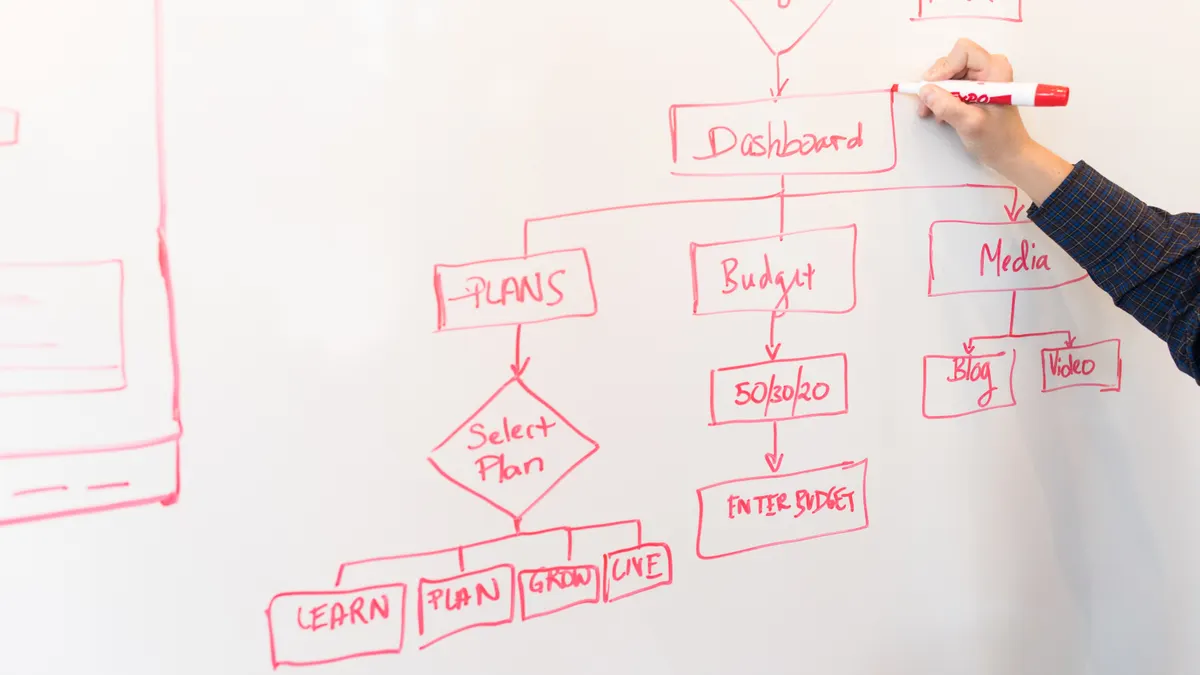
  • Content Standards and Editorial Process: The Complete Guide

    Content Standards and Editorial Process: The Complete Guide

    Last updated: October 21, 2026

    Quick Answer: For most teams, a simple content standards and editorial process can work in 2 to 3 review stages and under 5 minutes of checklist time per piece.

    In short: content standards tell writers what “good” looks like, and the editorial process makes sure every piece meets that bar before it goes live. This guide to Content standards and editorial process — The Complete Guide explains when a light checklist is enough, when a multi-step workflow is safer, and how to keep quality consistent without slowing production.

    Key Takeaways

    • Standards matter most when several people publish to the same site, because inconsistency appears fast.
    • Short, specific standards are easiest to use and check quickly.
    • Different review stages catch different problems; one pass is not enough.
    • The right workflow depends on risk and how often the piece will be reused.

    If you publish content for a brand, a newsroom, a SaaS company, or a regulated industry, you are not really asking “How do I write faster?” You are asking “How do I stop publishing inconsistent, risky, or low-trust material without slowing the team to a crawl?” This guide answers that. It shows when a simple checklist is enough, when you need a multi-step editorial workflow, and where most teams quietly break their own quality rules.

    What actually changes when content standards are real?

    Hand checking boxes on a tablet checklist

    Content standards matter most when multiple people touch the same site, because inconsistency shows up faster than bad grammar. If one writer uses AP style, another follows Chicago, and a third makes up formatting on the spot, the audience notices the wobble before they notice the insight. The fix is not more “care.” The fix is a written standard that covers voice, structure, claims, formatting, sourcing, and approval.

    If you only publish one or two pages a month, a 2-page standards doc and one editor may be enough. If you publish daily, or you have freelancers, subject experts, and a legal reviewer in the chain, standards need to be specific enough that the work can survive handoffs. That usually means three things: a style guide, a quality checklist, and an editorial workflow with named gates.

    A generic article gets this wrong by treating standards like a branding exercise. They are not. They are an operating system. They decide whether a piece is:

    • on voice
    • factually safe
    • formatted consistently
    • legally reviewable
    • searchable
    • updateable later

    The standards should cover the ugly details too. For example: do you use serial commas, title case, en dashes, 12-hour time, metric units, or AP-style numerals? Do you require sources for claims about price, statistics, or regulations? Do you allow first-person voice, and if so, where? These choices sound small. They become expensive when six editors interpret them differently.

    If your content has compliance risk, standards should include a review rule, not just a writing rule. Health, finance, and legal content often needs a second set of eyes from a qualified person before publication. That does not mean every sentence needs approval, but it does mean the process needs a hard stop for claims that affect money, safety, or rights. The U.S. Federal Trade Commission’s truth-in-advertising principles are one useful benchmark for marketing claims, and the Associated Press Stylebook remains a common reference for newsroom and brand style consistency.

    Quick check: If two competent writers could produce visibly different versions of the same piece on your team, your standards are too vague.

    How do I build content standards that people will actually follow?

    Content standards work when they are short, specific, and easy to check in under 5 minutes. If a writer needs to open four documents to answer one question, the standard is already failing. The safest version is a single source of truth: a style guide for voice and mechanics, a content brief template for the assignment, and a review checklist for editors.

    If you are starting from zero, begin with the rules that save the most time later. That usually means:

    1. Define audience and purpose in one sentence.
    2. Name the brand voice in plain language.
    3. Set rules for tone, point of view, and reading level.
    4. Decide what claims need sourcing.
    5. Decide what must go through legal, compliance, medical, or product review.
    6. Standardize headings, links, images, and calls to action.
    7. Decide what “done” means before the draft starts.

    A useful standard is specific enough to catch mistakes but not so long that no one reads it. For instance, “Use plain English” is weak. “Prefer short active sentences, define technical terms on first use, and avoid unexplained acronyms” is actionable. The second version is easier to enforce in an editorial queue or inside a CMS workflow.

    Here is a practical comparison of common situations:

    Situation Best Path Why Other Options Fail
    One writer, low-risk blog 1-page style sheet + simple checklist A full governance system slows publishing more than it helps
    Freelancers and in-house writers Shared style guide + brief template + editor checklist Rules hidden in Slack get forgotten and contradicted
    Regulated content Standards + documented subject-matter review + approval log “Trust the editor” is not enough for claims tied to risk
    Multiple brands or regions Brand-specific style addendum + master standards One universal voice guide usually blurs local differences
    High-volume SEO publishing Structured briefs + templated outlines + QA pass Purely manual review becomes the bottleneck

    If you want the standard to stick, write examples, not just rules. Show a bad headline next to the corrected version. Show a sourced claim versus an unsourced one. Show the preferred way to cite a regulation, a product spec, or a statistic. Writers learn faster from pattern recognition than from policy language.

    A strong setup for many teams is a 3-layer standard:

    • Layer 1: Non-negotiables — factual accuracy, legal review triggers, plagiarism ban, source requirements
    • Layer 2: Style rules — voice, punctuation, title case, formatting, image captions
    • Layer 3: Editorial preferences — preferred terms, CTA style, intro structure, link policy

    Do not make every preference a rule. The more exceptions you allow, the less the document matters.

    Quick check: If your standards are longer than the average piece brief and still leave room for interpretation, they need trimming and examples.

    The editorial process: what happens from draft to publish?

    Checklist on tablet beside a coding workspace

    The editorial process should catch different problems at different stages, because one review pass cannot fix everything. If you wait until the end to find a broken structure, unsupported claim, and off-brand tone in the same draft, you have built a rework machine. A better process splits the work into stages: brief, draft, edit, fact-check, review, approve, publish.

    If the piece is a simple how-to and the risk is low, a 2-pass process may be enough: editor review and final QA. If the piece touches pricing, health, finance, or legal advice, you need at least one more gate for accuracy and risk. This is not bureaucracy for its own sake. It is how you avoid publishing a sentence that should never have gone live.

    A reliable editorial workflow looks like this:

    1. Briefing: define the reader, search intent, angle, required sources, and exclusions.
    2. Outlining: check whether the structure answers the real question in a logical order.
    3. Drafting: write to the brief, not to the word count.
    4. Developmental edit: fix argument flow, section order, missing context, and weak evidence.
    5. Line edit: tighten language, remove repetition, standardize tone, and correct mechanics.
    6. Fact-check: verify names, dates, claims, figures, standards, and source links.
    7. Subject-matter review: confirm technical accuracy where needed.
    8. Final QA: check headings, links, metadata, accessibility, and formatting in CMS.
    9. Publish and monitor: watch for broken links, comments, and post-publication updates.

    The mistake most teams make is collapsing these into “editor review.” That sounds efficient until the editor is forced to do strategy, line editing, legal review, and CMS QA in one sitting. The result is usually rushed work or missed errors.

    This process should also specify turnaround times. A draft that sits untouched for 10 days is often worse than a shorter review cycle, because people stop remembering the original brief. If your team cannot move quickly, define what can be queued and what cannot. Time-sensitive pieces such as event pages, product launches, or regulatory updates need a different lane from evergreen guides.

    A good editorial process also names the owner at each step. If nobody owns the fact-check, nobody owns the mistake. If nobody owns the final publish check, broken links and formatting errors survive. Ownership is not the same as blame; it is the way the process avoids becoming everyone’s job and nobody’s job.

    Quick check: If a piece can reach publish without anyone being clearly responsible for accuracy, your process is too loose.

    Which parts of the process matter most for your type of content?

    The most important steps depend on the risk and the reuse value of the content. If the page is a one-off brand story, structure and voice matter more than regulatory citations. If the page is an evergreen guide that will rank for months, accuracy, scannability, and update discipline matter more. The same process does not fit every asset.

    If you publish SEO content, the priority is usually brief quality, search intent match, heading structure, internal consistency, and freshness checks. A weak outline wastes more time than a weak sentence, because it creates a piece that answers the wrong question. If you publish thought leadership, the priority shifts toward argument quality, originality, and fact support. If you publish help center content, the test is whether a confused user can complete a task without calling support. If you publish regulated content, legal and compliance review can outrank speed every time.

    Here is a simple decision path:

    1. If the content can affect safety, money, or legal rights, add a compliance review before publish.
    2. If the content is meant to rank in search, start with search intent, competing pages, and a precise outline.
    3. If the content is customer support material, test the steps for ambiguity and missing prerequisites.
    4. If the content is brand storytelling, edit harder for voice, pacing, and clarity than for keyword density.
    5. If the content will be reused in sales decks, emails, or social posts, standardize facts and claims so the same language can travel safely.

    The wrong move is to apply a newsroom process to everything. A breaking-news workflow, for example, values speed under pressure; an evergreen guide values depth and revision discipline. Likewise, a sales page may need a legal review that a blog post does not. The more different the content types are, the more dangerous a one-size-fits-all process becomes.

    A useful benchmark is whether the process removes uncertainty at each stage. After briefing, the writer should know the angle. After outlining, the editor should know the argument. After fact-checking, the publisher should know the claims are supported. If any stage still leaves major questions unanswered, the process is leaking.

    This is also where teams should decide what counts as “done.” A strong publication is not only a clean draft; it is a piece with approved sources, correct metadata, alt text where needed, and a plan for updates if the topic changes. That matters for time-sensitive topics such as software features, tax rules, or policy shifts.

    Quick check: If your toughest content type gets the same review as your easiest one, the process is probably misfit.

    When should content standards be strict, and when is flexibility better?

    Strict standards are worth it when inconsistency creates risk or waste; flexibility is better when creativity is the point. If your team writes compliance-heavy content, a rigid framework is a feature, not a flaw. If your team publishes opinion, brand voice, or experimental formats, over-standardizing can flatten the work until it sounds like every other site.

    If you are dealing with legal, medical, financial, or safety-related topics, strict standards should cover claims, sourcing, disclaimers, and review approval. These are not areas for improvisation. The U.S. Food and Drug Administration, the FTC, and similar regulators do not reward “close enough.” Even outside regulation, a reader deciding whether to trust you will not care that the draft was a creative success if the numbers are wrong.

    If you are dealing with creative content, flexibility matters in the intro, structure, and tone. A rigid template can kill the very thing the piece is meant to do. In those cases, keep the standards focused on non-negotiables: honesty, readability, brand boundaries, and fact safety. Let the writer choose the shape.

    The trade-off is simple:

    • More strictness = more consistency, less speed, less variety
    • More flexibility = more originality, more variation, more editorial judgment needed

    That trade-off should be explicit. A generic guide says “follow standards” and leaves out the cost. A useful guide admits that standards can become a creative brake if they are too broad. If every piece must open with the same formula, use the same subheads, and end with the same CTA, readers start to feel the machine behind the curtain.

    The answer is not to abandon standards. It is to separate structural standards from creative choices. For example, you might require a clear promise in the intro, a sourced factual core, and a final takeaway. You would not require every writer to use the same tone, pacing, or metaphor. That keeps the brand recognizable without making every piece feel mass-produced.

    One practical rule: the higher the risk, the tighter the standard; the more the content depends on voice, the looser the style. That principle keeps the process sane.

    Quick check: If your writers complain that the standards are making every piece sound identical, the standards are probably too strict in the wrong places.

    The 5 failure points most teams miss

    The failure points that hurt quality most are usually not dramatic. They are small cracks that repeat. If you fix only spelling and grammar, you miss the bigger operational problems that cause rework and weak publishing outcomes.

    1. The brief is vague.
      If the brief says “write something engaging,” the editor inherits the missing strategy. A better brief names the reader, question, goal, and exclusions.

    2. The standards do not say who approves what.
      If legal, product, or SME review is optional in practice, the team will ignore it when deadlines get tight.

    3. The checklist is too short.
      A 4-item checklist rarely catches claim support, alt text, link quality, heading logic, and title accuracy. You need enough items to check real risk, not just grammar.

    4. The process has no revision limit.
      Without limits, drafts bounce forever. A common fix is to define one developmental edit, one line edit, and one final QA pass before approval.

    5. The standards never get updated.
      Style guides rot. Language changes, products change, regulations change, and old examples stop matching the site. A quarterly or biannual review is often enough for many teams; high-change teams may need monthly updates.

    The most useful thing here is not perfection. It is a system that gets better when mistakes appear. If the same error shows up three times, the fix belongs in the standard, not just in the last comment thread. That is how content quality improves without adding endless labor.

    A mature editorial process also tracks where errors come from. If half the problems originate in the brief, the brief needs work. If most problems come from late-stage approvals, the approval gate is the issue. If the biggest pain is factual drift after publish, the team needs a content maintenance rule. A process that cannot diagnose itself is just ceremony.

    Quick check: If the same kind of mistake keeps appearing in different pieces, the problem is probably the system, not the writer.

    What should the content standards and editorial process look like in real life?

    The simplest system that still protects quality is usually the right place to start. If you are a small team, that may mean one standards doc, one editor, and a repeatable checklist. If you are a larger team, that may mean a governance model with roles, thresholds, and review tiers. The right answer depends on the size of the team, the risk of the content, and the number of hands on each piece.

    A practical setup for many teams looks like this:

    1. Create a standards document that covers voice, sourcing, formatting, and approval rules.
    2. Build a brief template that forces the writer to answer audience, intent, angle, and proof needs.
    3. Use a developmental edit to fix structure before polishing sentences.
    4. Use a line edit to remove clutter and enforce style.
    5. Require fact-checking for every claim that includes numbers, names, dates, tools, or standards.
    6. Route risky content through the right reviewer before final approval.
    7. Run a final CMS QA pass for headings, links, metadata, and accessibility.
    8. Review published content on a set cadence so standards stay current.

    If you need a single rule of thumb, use this: standards define the target, and the editorial process keeps the arrow on target. One without the other fails. Standards without process create a document nobody enforces. Process without standards creates motion without quality.

    The best reason to invest here is not elegance. It is fewer rewrites, fewer preventable errors, and less friction between writers and editors. The cost is real, though: a tighter process takes setup time, and it can feel slower at first. That is why it is not for teams that publish rarely, have low risk, and do not care much about consistency. Those teams can get by with a light checklist. Everyone else usually cannot.

    If you want a final test, look at the last 10 pieces you published. If readers could not tell where the standards ended and the process began, the system is working. If every piece looks and feels different, or if reviews keep turning into rescue missions, the system is too loose.

    For teams that need a reference point, AP Stylebook and the Plain Language guidelines from the U.S. government are both useful anchors for clarity and consistency, while ISO-aligned document control thinking is a helpful model for versioning and accountability. The exact tools matter less than the discipline: define the rule, assign the owner, check the output, revise the rule when reality changes.

    Quick check: If you can explain your publishing workflow in one clean paragraph, you are close; if you need a whiteboard, the system is not simple enough yet.

    Drafted with AI; not yet reviewed by a person.